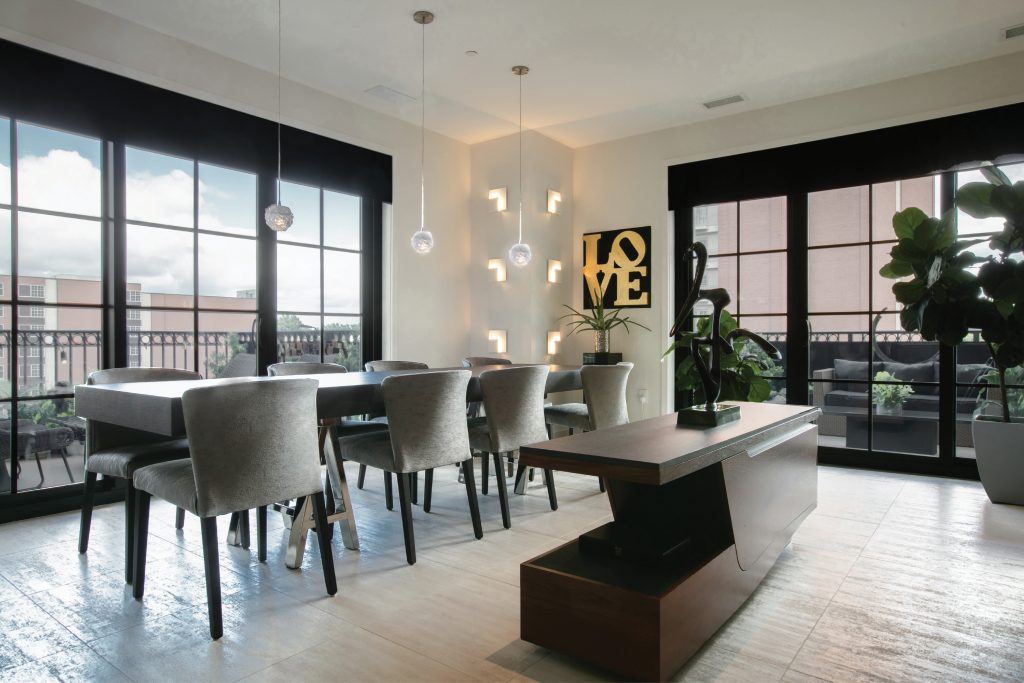
Carondelet Plaza is a shining example of urban living. Rising above downtown Clayton, it offers some of the finest architecture and luxury amenities in St. Louis—not to mention easy access to amazing shops and restaurants. The classic building gave owners of this condo the chance to create the home of their dreams. They gave T&S a peek inside at their fully renovated unit and its modern minimalist approach.
Why did you decide on a condo?
We started with a historic home built in the 1920s in Clayton and spent about 15 years renovating the property. We loved it but wanted to try new construction, so we built a new home also in Clayton. As time passed, we wanted to travel more, so we started looking at condominiums.
What attracted you to The Plaza?
We wanted to stay in Clayton. It’s a great area with lots of activity. It’s not a sleepy suburb, and you have a great mix of young professionals and older people. The Plaza’s location was perfect for what we were looking for. It’s within walking distance of so many great shops and restaurants. We’re right next to The Ritz-Carlton, St. Louis, so sitting on our balconies, we sometimes get to hear free performances from events at the hotel. It’s also relaxing to overlook the fountain. When we were looking for condos, we were originally a little worried that we were too young for the community. We found that there’s a wide mix of people from retirees to young families. One of our original neighbors had a preschooler. It was fun to see her around. She was just like the storybook character Eloise.
Did you make any major changes to the condo?
Our condo is actually one of the original display models, and it had never been updated. We had a very traditional house and then a very modern home, so we wanted to do something contemporary with the condo. We took the space down to the concrete before moving in. We raised the ceilings, changed plumbing, updated fixtures and moved rooms around—where the hearth room is now was originally the kitchen.
How would you describe your interior design style?
When we sold our last house, the buyers loved the furniture and decor so much that they bought quite a bit of it along with the home. We really had a fresh palette to start from scratch with in the condo. It seems like we’re going a little backward in our home decor. Instead of becoming more traditional, we’ve been becoming more contemporary. We really like a minimalist aesthetic and wanted to create a space that is aesthetically pleasing but not busy. That design approach also factored in our decision to downsize. By going minimalist contemporary, it’s easier to take care of.
Tell me about building your art collection.
It’s both old and new pieces. While we did sell some of our art with our last house, my art collection actually started with my mother, so there were certain pieces that I couldn’t part with. Two of my favorites that came from my mother are in the primary bedroom. They are by a Spanish artist. One is of two women bathing, and the other is a Madonna and Child. When it came to finding new pieces for the collection, it started with looking for pieces that fit the scope of the walls. When remodeling the condo, we wanted to make sure we had large wall spaces to accommodate different artwork. One of my favorite new pieces is actually in the primary bedroom’s closet. The space just felt empty so we wanted to find something for it. We found a piece by Donald Baechler that is very unique.
How is the condo for entertaining?
We do entertain quite often. Since moving in, I ran for the board of the homeowner’s association and am now the youngest member. I was made the chair of the social committee, so I’m working on more socialization throughout the building. The Plaza has a large social club room that has a catering kitchen and a nice enclosed patio off to the side. In our condo, we have two patios and a great dining room for entertaining.
Do you have a favorite room?
My favorite room is actually the primary bath. The shower is my favorite feature and was actually my idea. I was inspired by an outdoor shower I had seen in Mexico. I wanted a no-threshold shower with a knee wall with no glass. We weren’t sure it was going to work. After we put in the features, there was a chance we’d turn it on, and there’d be water on the wrong side of the wall. Thankfully, that wasn’t the case. It worked, and we had an open consent without glass that would steam up. It really gave us that minimalist look we were looking for.
