After 21 years in New York, St. Louis natives John and Nancy Quicke recently returned to their Midwest roots. They were on a mission to find a Clayton house that met a reasonable list of expectations. While the couple was drawn to the charm of older homes in the area, they wanted a more modern, open floor plan and didn’t want to be bothered with upkeep. In the end, they discovered a builder who gave them both. Through a team effort, they created a three-bedroom oasis with access to all the city has to offer.
T&S | Why did you choose Clayton?
Nancy Quicke | We originally lived in West County after we were married, before moving to Chappaqua, New York, in 1993. When we decided to move back in 2013, we liked the Clayton area for the ability to walk to restaurants, shopping and even the government center! That’s what intrigued us about the area. And one of our sons lives in the U. City area.
T&S | When did you decide to build?
NQ | We wanted a house where we could entertain family and friends easily, and we just weren’t finding what we were looking for. Our builder, Mike Rechan of Michael Lauren Development, had some properties for sale, and we loved the style of his homes. They all had the older charm we admired. We also liked the architect he works with, Paul Doerner of Lawrence Group, who was very involved with the design of the home.
T&S | Building a home can be a trying time. How was the process overall?
NQ | Everyone was so lovely to work with. I can’t say enough about Mike and his entire team. We hired Elizabeth Glazer as our interior designer, and it really was a group effort. She was so instrumental in getting all the furnishings and helping choose the finishes. John and I had to do a lot of it long distance, and everyone made it so easy. Michael Lauren also built the homes of our two next-door neighbors; the community is really appreciative of having beautiful homes as opposed to the abandoned structure that was there before
T&S | What ‘must-haves’ were on your list?
NQ | A wet bar was important to us, as well as a hearth room. I really wanted an area that was separate from the TV room and easily accessed from the kitchen. It’s a great reading area. John and I both wanted office spaces that were close enough to communicate with each other. And he didn’t want his to be stuck in the back, away from all the action!
T&S | It all looks very calm. Were you going for a certain style?
NQ | I don’t like a cluttered look and tend to keep things simple and clean. Our house in New York was traditional, so I wanted something different but not contemporary. My style is transitional: modern, with the softness of some traditional looks. We only brought one piece with us: a nice blue sofa that I recently had recovered, so the color scheme came from that. Gray and blue tones went well together.
T&S | The dining room is very dramatic.
NQ | Paul came up with that idea, and Mike didn’t know how we would react, but we fell in love with it. We didn’t want the dining room to be tucked away and not used. This way, it’s a focal point with its open ceiling. I seated 24 people there for Thanksgiving, and I just hosted a birthday lunch for my 85-year-old mother and 21 of her friends. I simply add an extension or two onto the table since there’s plenty of room. The entire house is conducive to entertaining.
T&S | The powder room is unique as well.
NQ | I loved that tile on the back wall but thought it might be too busy for the entire space. So Elizabeth found the perfect wallpaper to complement it. I think powder rooms should be dramatic since they’re so small, and I like them to have a converted chest with a bowl sink instead of a typical vanity.
T&S | Do you have a favorite room?
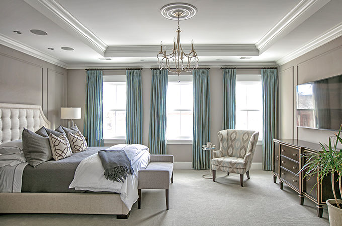
NQ | I’m really happy with how the master bedroom turned out, especially the tray ceiling. And I love the molding Elizabeth added to the walls. It’s fairly large, but with all these touches, the room still feels comforting and cozy.
Photos: Suzy Gorman
