inside look: kips bay showhouse
It seems fitting that for my last column as a regular contributor to Town & Style, I should write about one of my absolute favorite topics: a designer showhouse. In May, the Kips Bay Boys & Girls Club of New York City once again opened a magnificent home. This year, a townhome on the Upper East Side was completely redone from top to bottom. It was six floors of room after room of incredible inspiration! This is the 46th year for this successful fundraiser, and the 22 interior designers working their magic on 72nd Street exceeded my expectations. The 15,000-square-foot home can be yours for a mere $51,000,000 … in case you’re in the market.
a few highlights
As you enter the foyer, you are immediately surrounded by a sense of history. The handpainted, scenic wallcovering serves as a backdrop for black lacquered commodes and French side chairs upholstered in smart black and white stripes. You feel a sense of calm and anticipation as you begin your journey.
» The kitchen remodel by Clive Christian is up to his usual standards of fine wood cabinetry that adopts the rule of ‘form follows function.’ The two large Baccarat ‘shade’ chandeliers make a subtle but important statement as they float above the oversized island, illuminating the wonderful gastronomical creations prepared by the family chef.
» Nievera/Williams of Palm Beach used whimsy to soften the square hardscaping of the outdoor garden with ‘instant espalier’ scroll patterns throughout. A wonderful place for morning coffee or an end of the workday cocktail!
» The dining room/library executed by Barbara Ostrum is a highlight of the home. Using high-lacquered walls, she manages to envelop you in the space with the most interesting shade that isn’t quite peach and isn’t quite coral. She created a Frank Stella-inspired pattern on the ceiling, a real showstopper. Her attention to detail on the moldings draws you even deeper into the space, and her use of multiple textured and patterned fabrics is nothing short of brilliant. Two crystal obelisk lamps on the dining table illuminate that end of the room, and a magnificent mahogany breakfront is filled with fine leather-bound editions.
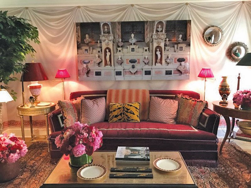
» Alexa Hampton creates a living room with a definite tip of the hat to her incredibly talented father, the late Mark Hampton. This Neoclassical space is perfection in scale and proportion and the faux draped walls, inspired furnishings and accessories make you feel as if you have stepped into Malmaison, Napoleon and Josephine’s home just outside Paris.
» The drawing room is all about layering. Phillip Mitchell created a room of collections that are so brilliantly displayed, visitors just keep discovering interesting items everywhere they look. The attention to detail in the moldings transformed a very pedestrian space into a historically inspired retreat that anyone can enjoy. It’s designed with his two puppies in mind, and there isn’t a space that his canine children couldn’t or wouldn’t call their own.
» Bunny Williams has served in a chair position for the Kips Bay showhouse for many years, and her design contribution this year was fresh and current. In her space designed as a living room, she used a faux bois technique on the walls in shades of pale creams and tans with knotholes highlighted in gold leaf. Brilliant! I can only imagine how the room glows in the evening. A master of balance and harmony, she created two seating areas at each end of the room so entertaining is easy.
» The top floor was reincarnated as a spa. Charles Pavarini III and his firm created a zen-like area complete with massage table, refreshment center, outdoor terrace for meditation and small seating area. The most interesting items used were outdoor furniture pieces that looked as if they were covered in artificial turf. It actually was a new synthetic product for outdoor upholstery that was quite comfortable to sit on.
» Last but certainly not least is the lower level, brilliantly conceived by Juan Montoya. He took two bland box areas and created the most restful Art Deco family space. His use of blue and white and architectural detail took this basement from blah to ahhhh.
A showhouse should inspire and intoxicate your design senses. This year’s Kips Bay home excelled in both areas. The attention to detail in each room engaged the design aesthetic on every level.
I also want to take this opportunity to thank you, my readers, for being so loyal and kind. Lauren Rechan and Dorothy Weiner took a chance on me, and it has been my thrill and pleasure to research and write about all things design to share with the St. Louis community. Three years ago we purchased a second home in Palm Beach, and it is now time to make a permanent move. I still will return to the St. Louis area for projects with treasured clients. Always remember to stop and see the beauty around you.
Cheers! – Alan Brainerd
