inside look: using plants indoors
A few years back, I was fortunate to tour the Connecticut country home of Bunny Williams and John Rosselli with a dear friend. What a thrill to see how this power design couple relaxes on the weekends away from their international business obligations in a bustling city.
It also was nice to see that people still collect. Of course, being in the business (she, a celebrated interior designer; he, an antiques dealer), it comes with the territory! They seem to adhere to the philosophy that ‘more is more,’ and it’s only gaudy if it’s someone else’s. I felt like I was in heaven!
Bunny is a world-renowned designer for a reason. Yes, she loves lots of things around her, but she also knows the principles of scale and proportion and doesn’t vary from these important rules. It is possible to go into a collector’s home that is filled feeling at peace rather than overwhelmed. That peace comes from the ability to properly execute the placement of every single item so that the balance of the space is correct and the visitor is simply enveloped in the joy of the collection. Bunny is a master at this.
I limit the number of live plants I keep in our home. Due to my travel back and forth to Palm Beach, they tend to get a bit neglected, and I hate to see them die. Bunny, on the other hand, has a plethora of plants. Of course, having full-time help does increase the possibility that the plants will thrive.
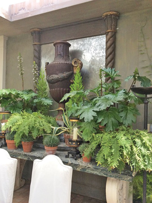
I was taken by her wonderful use of greenery as sculptural design elements in her conservatory/dining area. She banked them in levels on a wonderful stone sideboard to create height. Using an antique mirror as a central focal point, its dull shimmer, framed by the healthy green leaves, created a grand scale tableau that works year-round in the space. I am sure, like any interior designer worth their weight, she changes things up a bit from time to time, but if she opted not to, this would serve her well for years to come.
50 shades of: pink
Used a great deal in stylish interiors in the 1950s, pink is now now making its resurgence. As Kay Thompson so brilliantly sang about this color in the acclaimed film Funny Face starring Fred Astaire and Audrey Hepburn, think pink!
This color is flattering to skin tones, casting a natural, romantic hue. Elizabeth Taylor was known for using pink bulbs in all of her lamps and for the lighting in her Rolls-Royce Silver Shadow. As I age, I’m beginning to think this is an excellent idea!
The Sherwin Williams color In the Pink (SW6583) is not too light and not too strong, making it the perfect backdrop for just about anything. Dark woods will look splendid against this hue, as would a wild, contemporary painting. I realize men may shy away from it, but I am sure the lady of the house will find a way to convince him to try it. After all, it is the month of love.
I love watching the old black-and-white MGM movies from the ’30s and ’40s. As a designer, I always imagine what the actual colors were for those fabulous, classic Art Deco interiors. When perusing through books that actually feature color snapshots of these sets, it’s amazing how much metallic and foil material was used on the walls and furniture.
In the 1960s, some rather garish attempts were made by manufacturers to bring back the ‘foil’ look. It met with some success, but fell more into the trend category than the classic one. I blush to admit that my mother’s decorator convinced her to use a foil and flocked damask paper in our hallway in my childhood home.
Fast-forward to today, and we see elegant metallic and foil papers being offered by the best design houses. Harkening back to classic styles dating all the way back to the 17th century, one can recreate these timeless looks in a fresh, updated way. Detailed aviary and branch panels or architectural bamboo designs can grace your walls, ceilings or doors.
There is nothing new under the sun, but when a design house takes the best from the past and reimagines it for today, a winning combination is created.
