designer >> jesse bodine
One of my favorite things to do when remodeling a home is to know its past to prepare for its future. Welcome to the Maplewood house. Our clients knew the bones of this house were strong. They purchased the home realizing it needed a complete remodel, but they saw the potential within the space to make their vision a reality. They approached us, gave us their wants and needs, and let us create the home of their dreams.
When we were discussing the remodel with the owners, it was apparent that the kitchen was their top priority. Not only is one of them a professional chef, but they also spend the majority of their free time in the kitchen cooking, entertaining and relaxing. They wanted function, fun and fashion—all in their style to reflect who they are as a cooking couple: eclectic with a dash of traditional.
Upon entering the kitchen, we immediately noticed that space was limited. More space was needed to give that grand feeling they desired. To create a larger entrance into the kitchen, we widened the doorway that leads to the dining room, which immediately created an open feeling. We then used the existing walls to transform the kitchen into an L-shaped space, which allowed us to install cabinetry on both walls where storage space was limited in the previous layout. Once we completed the open layout our clients wanted, we focused on their personal styles.
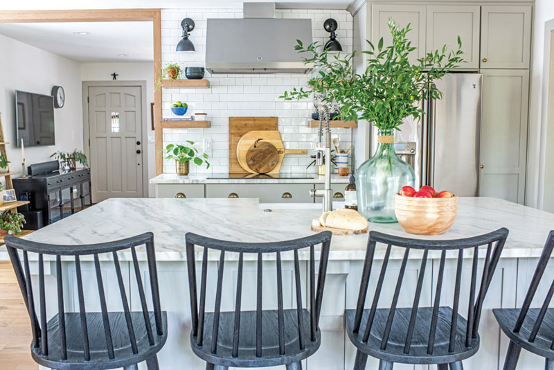
We knew the kitchen needed an island as the focal point, so we installed a gorgeous marble piece that makes quite an elegant statement. It’s beautiful and grand and gives a modern, clean look. To tie in the cabinets with the marble, we decided against white and had them painted in Northern Cliffs by Benjamin 1536. This color provides needed warmth and will show less wear and tear over time. Top cooking skills require quality appliances, so an induction cooktop was a must. We completed the top chef look with a hood and surrounded the space with open wood shelves for an eclectic feel. It also gives our clients the chance to showcase their favorite spices, recipes and cookbooks! All of the cabinets were given warm brass cup pulls for a traditional look to contrast with the stainless steel appliances.
Entertaining in the kitchen was a top priority for our clients, so to maximize the space available, they decided against a traditional breakfast table and chairs. We added seating to the kitchen island with Four Hands Lewis Windsor bar and counter stools. Everyone can sit at the island and be part of the cooking process, or just relax. It’s an instant space saver and the perfect option for entertaining!
Scout & Nimble is a retail site and blog that aims to make expert design accessible to all. Follow at blog.scoutandnimble.com.
Photo above: Emily Sewell and Drew Piester
