When the opportunity presented itself to work with a repeat client, we couldn’t have been more excited. We were first introduced to this lovely family two years prior when we helped with a remodel and addition to a home they had purchased. We left two areas unfinished at the time, the front room and the basement, because they wanted to live in the home for a while before deciding how to use the spaces. We were so happy when they called saying that they wanted to create a family room and guest suite in the basement and a library in the front room!
When you enter the home, the front room is immediately to the left. We knew it would be important to make the entryway flow nicely into the new library while keeping the history of the home in focus. Our main goal was to make the library warm and inviting but also family-friendly and usable.
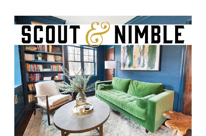
The house was built in the early 20th century and had original plaster walls. For the library remodel, we wanted to create an intimate space that would draw guests in, especially since it is one of the first rooms people see when entering. Once we had our built-ins designed and added to three walls, we chose one of our favorite paint colors, Gentleman’s Gray, a deep gray-blue by Benjamin Moore. We painted the walls and all the trim detail to really make a statement.
Since we were going dark on the walls, we knew the lighting for this space would need to prevent it from feeling too heavy, especially in the evenings without natural light from the three windows. Above the bookcases, we added three brass sconces that look luxurious against the blue walls, plus a floor lamp as a task light.
The clients had expressed interest in a green velvet couch, and lucky for them, we had the perfect one. The placement of the couch beneath our striking Strewed Blues artwork provided a great focal point for the library. To round out the look, we added one of our favorite coffee tables to the mix. Its edgy brass base ties in perfectly with the wall sconces. We love the details of this table, and it is the perfect place for the family to enjoy games, puzzles and other activities. And our Nyla Slate rug ties the room colors together while providing a foundation that is light and bright.
Another improvement to the room is added storage cabinets that double as window seats. They give the family a practical place to store belongings and also serve as reading nooks for the kids. We loved everything about this home remodel! It was our pleasure to work on it, and we are excited that our clients finally have their dream home complete.
Scout & Nimble is a retail site and blog that aims to make expert design accessible to all. Follow at blog.scoutandnimble.com.
