Renovations and additions add value to a home and can transform it into your dream space. So what kind of changes are on the most-requested list? Architects, designers and builders weigh in on what’s hot right now.
[keep it simple]
For the past few years, homeowners have desired a simple, streamlined look, says Ellen Kurtz of boutique design firm Ellen Kurtz Interiors. “People are cleaning up and putting things away,” she says. “They don’t want as many accessories or items out.”
Because they can add a light, clean feel to a room, grays, pastels and shades of white are eclipsing browns and earth tones as popular color choices, Kurtz adds. And this goes for furniture, too. “Sunbrella, which makes outdoor furniture, has a line that can be used indoors, so people can get that light look and not have to worry about durability.”
[in the kitchen]
The kitchen is a perennially popular area of the home for additions, says Kent Higginbotham, president of Homes by Higginbotham. “Homeowners often make the kitchen larger or expand to an open concept,” he says.
Quartz is becoming a more popular countertop option, because it is both durable and easy to clean, Kurtz adds. Another unique option is concrete, says Mosby Building Arts architect Brian Yount. And rather than a tiled backsplash, some homeowners opt for a large slab of marble, says Jay Eiler, designer with Castle Design. “This gives the kitchen a clean, dramatic look,” he says.
Another kitchen trend: light-colored cabinets with inset doors that sit flush with the cabinet frames, paired with darker island and base cabinets, says Kurtz. The lighter upper cabinets lend an airy feel to the room, and the contrasting colors add visual interest, she says. And as always, a large kitchen island usually tops homeowners’ must-have lists, Higginbotham says. “It’s where everyone always ends up.”
[in the bathroom]
Showers are the focal point for many homeowners renovating a bathroom. Kurtz has seen an uptick in lowering shower floors and getting rid of the curb so it is easier to maneuver for older adults. Some homeowners even remove the tub from the master bathroom. “As people age, they’re more interested in making sure bathrooms are functioning for them,” Kurtz says.
Tile and stone are popular shower materials, Eiler says. “Homeowners want that ‘wow’ factor, and you can do that with tile and stone, which are beautiful and inexpensive options. And porcelain is big in flooring, too. It’s extremely resilient and a cost-effective solution.”
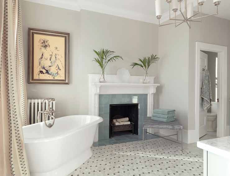
In lieu of large, spa jet tubs, homeowners often opt for smaller, free-standing tubs. “They can be anything from traditional to transitional or contemporary,” Eiler says. “It really adds to the room and frees up space.”
And one unique option for a bathroom vanity comes from Yount, who recently completed a project that included an onyx vanity lit from within.

[going green?]
Homeowners sometimes go the green route, but only when it makes sense for their budget. “People have good intentions, but when it comes to their pocketbook, that still rules,” Higginbotham says. “However, as the gap narrows in price, green materials get more popular.”
“My clients aren’t going to do it if it’s too expensive or not a good product that’s going to last, so I try to help them navigate through the hype and figure out what their choices are,” Mosby’s Yount says. “We kind of view our role as educating people. Sometimes they’ll want to use bamboo flooring, but if that’s coming from Southeast Asia or China, is that really the sustainable choice if you’re hauling it over here? Does it make more sense to get Missouri-grown oak?”
[long-term planning]
Master planning, which involves a multiyear course of action for updating and improving a home, has been on the rise at Mosby Building Arts, says Yount. “The homeowner may plan to do a full kitchen renovation this year, a master suite renovation on the first floor the following year and maybe a third project the year after that,” he says. “We look at it holistically, so we plan it all the first time and keep on track with the plan we’ve come up with.”
By Stephanie Zeilenga
Photo: Castle Design