
Building this house was a dream of mine. Normally, I’m working with clients to bring their vision to life. With this one, the vision was mine from the very beginning. Every choice. Every detail. I’m so grateful I got to lean all the way into my own design style.
The Foyer – Setting the tone
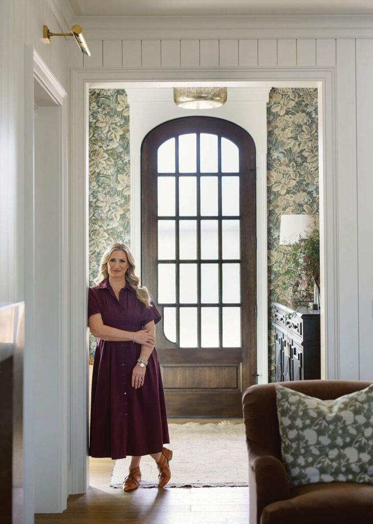
The foyer is the first impression of a home. And while this one isn’t huge, it does exactly what a foyer needs to do. The custom white oak front door, with reeded glass for privacy from the street, opens straight into the space. From there, your eye lands on pieces I’m honestly obsessed with: a substantial sideboard, a gorgeous gilded mirror, an alabaster lamp on a timer for ambient light at dusk. Beautiful and functional, both. But more than anything, I wanted you to walk in and feel an immediate exhale, grounded.
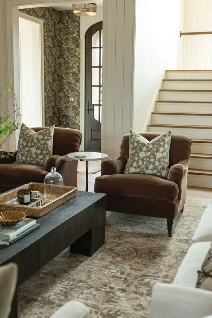
What I love about this little room is that it has two opposing views pulling at you at once. Look one way, and the hallway draws you down toward the more intimate spaces—the primary, the office, the sunroom. Turn your head, and the next view is into the living room, the heart of the house. I love designing rooms that pull a person through to what’s next. But for that to work, the foyer has to stand on its own, too.
That’s the feeling that made me change the wallpaper two weeks before install. I had a soft stripe planned for months, and right at the end, I called it—the room needed something heavier and moodier to carry the groundedness I was after. We landed on this neutral foliage pattern with little hints of green and blue threaded through it, and it was the exact thing the space needed.
The four intaglio prints above the sideboard were also a last-minute addition. I love the fresh take on the color and the little bit of traditional flair they bring in. Together with the wallpaper, they set the tone for the rest of the house. Put together, but cozy and inviting. A little unexpected.
The Living Room – The room you actually live in
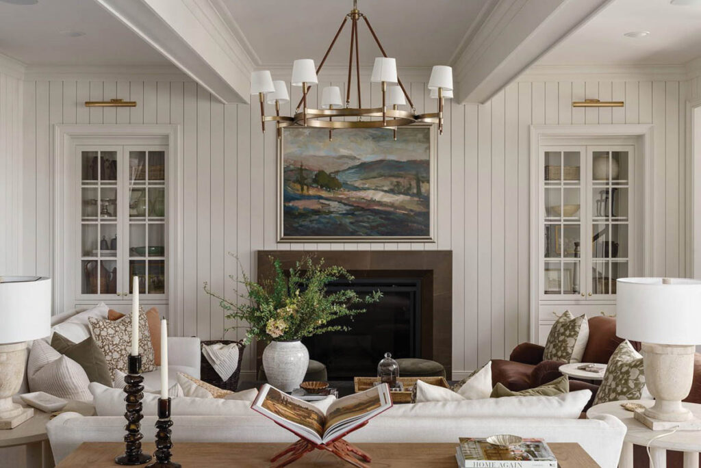
I wanted this room to feel inviting and welcoming, the kind of room you actually live in. The art over the fireplace was my launch pad for the whole house. I saw it before I’d chosen anything else, and I fell in love on the spot. The greens, the blues, the dusty rose, the warm earth tones in the marble, every color in this house traces back to that one piece. It was the perfect color story for this entire home.
For the built-ins, I went smaller than what you’d see in most new builds, and that was intentional. Big floor-to-ceiling built-ins can feel intimidating to style, people start feeling like every shelf needs to be perfect. So I did a throwback to the niches you’d see in classic historical homes, with drawers on the bottom for storage and glass doors on top for display. It takes a lot of the pressure off.
I covered the walls in tongue and groove and layered in beautiful millwork, which gives the room real architectural depth. But with all those traditional notes, I knew the fireplace itself needed to push the other direction, something more modern, with cleaner lines. A substantial marble surround with clean mitered corners gave me exactly the juxtaposition I needed. Without it, this room would have leaned too far traditional.
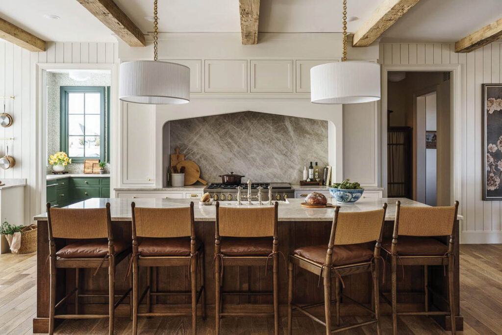
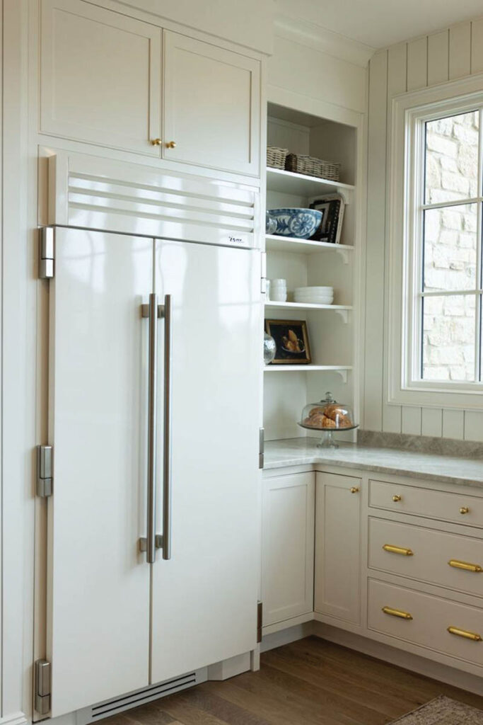
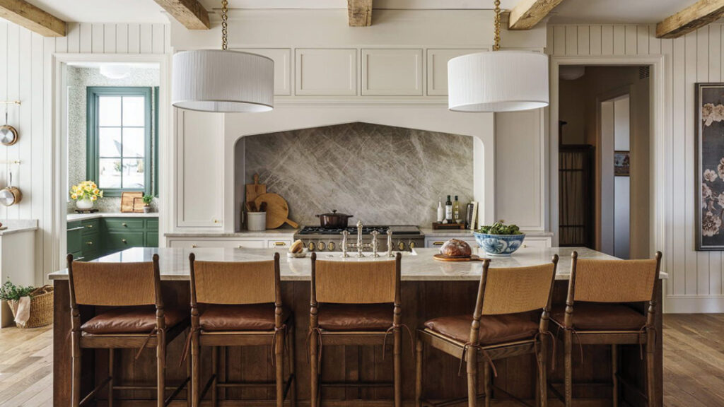
The Kitchen – The three zones
I’m obsessed with this kitchen. I just want you to know that going in. The kitchen is the heart of the home—that’s always been true. But it’s also the hardest-working area of the house, and you have to design it for both jobs. So we did a three-zone kitchen.
- Zone one: Cooking and prep
- Zone two: Side kitchen
- Zone three: Scullery
Three zones, nobody crowded, nothing too far away. People look at this floor plan and tell me the fridge is too far from the range, and I think they overthink it. When you’re standing at the island, the fridge is right there, and honestly, my actual workflow rarely calls for going from fridge to stove in one motion. What this layout really gives you is room. When everyone naturally drifts into the kitchen the way they always do, nobody’s bumping into the cook, nobody’s getting in the way. People can actually gather and hang out in the heart of the home, which is what a kitchen is supposed to be for in the first place.
A few details worth knowing about. The countertops are Taj Mahal quartzite. I think of natural stone as art, it’s literally formed in the earth, every piece is completely unique, and it wears so well over time. We did a creamy white kitchen with a dark-stained island for contrast. We have double dishwashers, because if you’re entertaining, you don’t want a sink full of dirty dishes. We have pullouts on either side of the range for canisters and spices. Two towers on either end of the hood for plates. A paper-towel pullout, so you’re not setting a paper-towel holder out on the island. Bells and whistles, all of them earned.
Design: Jesse Bodine
Architectural Photos: Matthew Anderson
Lifestyle Photos: Sammie Ploch
Product Photos: Anna Hennessey
Floral Styling: Sarah White
Scout & Nimble is a retail site and blog that aims to make expert design accessible to all. Follow at blog.scoutandnimble.com.