Dear Homework – My husband and I purchased this fixer-upper because of the wonderful wooded setting and open floor plan. But when it comes to the front, it disappears and lacks curb appeal. What might you suggest to give it a more striking personality than its current plain and gloomy appearance?
Sincerely,
—Plain and Gloomy
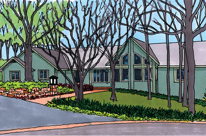
My first reaction to your photo was … “Where is the front door?” I assume it’s at the end of the walkway, but wherever it is, it should be the most prominent element on the front façade. You will see that I show a new, curved, stone retaining wall (with lantern) to help point visitors in the right direction. A long border of red, shade-loving impatiens will help contrast the gloom.
You also will observe that I’ve changed the color of the façade but left the trim color the same. This helps give the architecture a sense of detail currently missing by being all the same color. A new lower-level window also helps give a reason for all that unadorned siding.
Finally, you will see landscape upgrades at the foundation and the curb; they bring a sense of order without feeling too ‘manicured.’ I have also removed two of the trees to open up the view to the house without undercutting the forested feel. Hopefully, this brightens your outlook on the situation.
Sincerely,
—Homework
[Homework is penned by Paul Doerner, Founding Partner of the Lawrence Group. If you would like your home critiqued, contact us at homework@townandstyle.com.]
