Dear Homework: Love our house, but it’s looking dated, very ’90s to us. We would love any input in changing siding, windows, landscape or anything else to make it look more modern. It’s too white from October to April. We aren’t attached to anything—in fact, I hate that second-floor porch over the door. Any suggestions are welcome.
Sincerely,
—Trapped in the ’90s
Luckily, your home has many assets. It has a nice wide lot and is well framed by large trees. The classic ‘center hall Colonial’ is a look we can easily enhance, and your lime-green front door is a great starting point for a livelier color scheme.
I think the problem with your house is not so much that it feels like ’90s, but that it is brought down by builder-grade details. The front porch and the center, second-floor windows are clumsily handled. The shutters for the arched windows and the less-than-lush landscaping also lower the tone of the whole presentation.
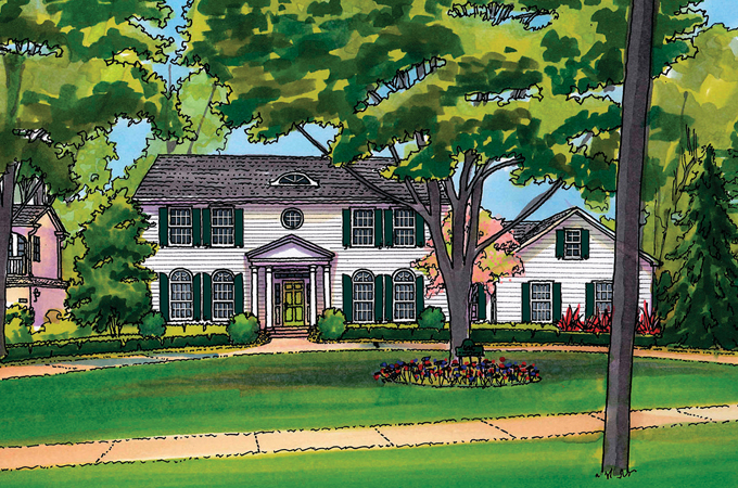
You will notice I have rebuilt the porch with a more classical feel and included a bold, round window and eyebrow attic window. The arched ground-floor windows now have appropriate arched shutters, and I have added a second-level window in the garage wing. These architectural upgrades give the home a more timeless feel.
The landscape enhancements include plantings to isolate the neighboring properties. A low evergreen hedge follows the curve of the circle drive and ties the whole façade together. Several flower beds add summer color, while teal shutters will add interest in the dead of winter.
To my eyes, your house now looks like an elegant estate rather than just another home on a street.
—Homework
Homework is penned by Paul Doerner, Founding Partner of the Lawrence Group. If you would like your home critiqued, contact us at homework@townandstyle.com.
