Dear Homework,
I am in the process of updating the front of a house I recently purchased. I have started some landscaping and plan to remove the large Sweet Gum tree in the front yard because of the large amount of gumballs it drops. I am afraid after this large tree is removed, the house will look even more flat and unappealing. I had an irrigation system installed and hopefully can improve the look of the lawn this spring. I also am going to replace the brown fascia and gutters with new white ones, and remove the ’70s eagle. I don’t know how to make the front of the house look more interesting. I may add gray vinyl siding but would love to hear your suggestions. It is such a flat roofline, and the lack of shutters makes it difficult. Looking for inspiration.
Thanks in advance!
—Inspire Me
Dear Inspire Me,
In an effort to inspire you, I am going to show three different looks that are appropriate for a ranch house with a shallow-slope roof.
In the first version, I apply Craftsman-style elements to the front elevation. With the numerous vertical trim pieces and wood columns, the porch now has a more upright and welcoming feel. The windows have received new Craftsman mullions and a new color scheme that blends all the façade pieces together. A generally horizontal landscape scheme is vertically accented with two Clump Birch trees, and a new entry walkway is centered on the revised porch.
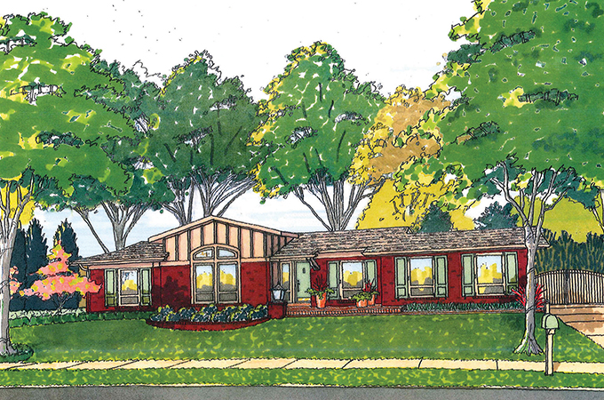
The next scheme removes the existing porch and raises the roof over the living room, which features a new, taller, arched window. A new brick planter, light pier and entry terrace add interest. New shutters and roofing mellow the color scheme. Note that all the existing white bricks have been painted to tone down their jarring effect. This version has more dimension than the original.
The final version develops a midcentury vibe on the existing façade. A new shed roof over the living room provides the dominant feature, which is amplified by a new brick planter. New, stained redwood elements bring a horizontal accent to the composition. The existing brick has been painted gray, which works well with the existing white windows and the new black front door. Again, very low landscaping allows all of the rather low elevation to be seen.
I believe each version has some interesting possibilities that will hopefully inspire you to see your home in a new light.
Thanks for asking,
—Homework
Homework is penned by Paul Doerner, Founding Partner of the Lawrence Group. If you would like your home critiqued, contact us at homework@townandstyle.com.
