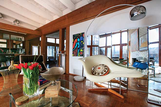
To live in a house like this, you have to appreciate its story, to respect the creative mind from which it emerged. The family that occupies the midcentury gem on the grounds of Westwood Country Club embraces the historical importance of its architect, Isadore Shank, a local prodigy highly influenced by Frank Lloyd Wright. The couple worked hard to preserve his vision, one that encouraged a seamless merging of outdoors and in and favored simplicity.
Q | How long have you lived in the home?
A | About seven years. I’m originally from Austin, and my wife and I moved here from Santa Fe, so I was very into Native American art and design. We lived in a couple of homes in St. Louis that reflected that, but then I went completely the opposite and became more minimalist, which encouraged my love of midcentury style and integrating nature into the home. Shank did an amazing job of this, just like Wright and Bernoudy.
Q | Why do you appreciate midcentury design?
A | I love the clean lines. I’m a men’s fashion designer, so for me, the house is an extension of my aesthetics. Being in fashion design and being an artist, you have to have the right environment to encourage that and match your interests. The furniture in the house also matches this style. Most is vintage from the time period (late 1950s), but it’s mixed with ’70s eclectic pieces. Others I inherited from my family.
Q | The artwork follows the same aesthetic.
A | A lot are pieces I did, like the ones over the fireplace. Otherwise, it’s a mixture of vintage finds and artwork from my family as well.
Q | What were some of the projects you had to do?
A | We tried to keep it as close to its origins as possible while knowing that there is real life going on in this house with two kids and three dogs! Some people come in and completely gut homes like this, replacing what was there with materials and fixtures that ‘look’ original. We wanted to keep as many original handles, pulls, cabinets and floors as we could. The integrity and basic bones of the home were intact; it was just a matter of updating. The lower level was the biggest area we tweaked. We wanted to make it more of a rec room for our sons. The majority of Shank’s vision is upstairs, though. The slate floor in the entryway and by the garage door is original, as is the parquet flooring throughout the main level, which we refinished. We pulled down a lot of grass paper from the walls. We reconfigured the bathrooms, but kept the vintage marble and medicine-type cabinetry. We ended up having to replace the fixtures and handles. As far as I know, the cabinets in the kitchen are original; we just switched the handles to stainless steel. And we kept the marble there, too; I like the vintage look.
Q | The house seems so airy.
A | Everything is open and spacious. A midcentury modernist embraces nature with its surroundings. I don’t care for a large mansion with tiny trees; there’s no balance to that. There are large, floor-to-ceiling windows throughout the home, and we don’t have any curtains. The woman who lived here before us had heavy brocade drapes up, and the very first thing we did was yank them down. We want to let in all the light we can, but it’s still private. There is a brick wall on our patio with little peekaboo openings (signature Shank) that acts as a barrier. And our bedrooms and the TV room all face woods, so we’re blocked in that way. On a sunny day, there is a beautiful flow of light.
Q | Is the sunroom an addition?
A | Yes, that was done later down the line. We found a box of original blueprints drawn by Shank, and that room wasn’t on them. It’s nice though, and the previous homeowners did a good job of integrating it into the house. It has removable windows so in the spring and summer, you can just have it open or use screens.
Q | Have you added anything to the home?
A | I designed the little wall with colored rectangles because I wanted to block what was there. A contractor built it for me. There is crushed rock under the house that you could see from the pool and lower level, so I came up with that to frame it in. I was influenced by the Dutch painter Piet Mondrian. When you’re sitting by the pool, all the colors are filtered by the sun, and when you’re inside, they’re filtered through the windows.
Q | Do you have a favorite room?
A | The front living room with the fireplace. It’s really open, and I like to sit on the Milo Baughman lounger and read with a cup of coffee in the mornings. Because of the room’s large windows, which can open up to screens, nothing feels dark or dreary, even in Missouri winters. The fireplace used to be red brick, and even though Shank followers and midcentury design aficionados might not agree with my decision, I painted it white to bring in all the light I could and to better show off the artwork.
Photos: Suzy Gorman
