T&S | For a time, you lived in New York. How did that experience influence the decor of your home?
KP | I lived in little tiny shoeboxes in New York, but I’ve always loved colors, patterns and different textiles. When we finally bought a home and had space, and I knew we were going to stay awhile, it was fun to put things together.
T&S | How would you define your design aesthetic?
KP | It’s pretty eclectic. I definitely like to mix antiques with more modern furniture. I also like to mix colors and artwork that don’t initially seem like they would go together, but then they somehow do once you get them into the right space.
T&S | What’s your design process like?
KP | It kind of just comes together, but for most of the rooms there has been one thing I love that I decorated around: a piece of fabric or art that set the tone. In our living room, the sofa is from my grandparents from the ’50s . It had an old fruitwood finish and old cushions, but I had it reupholstered and new pillows made, so that’s a special piece. I had to convince my grandmother to give it to me, and I’ve had it since 2008 and just love it. I’ve changed all the furniture around it, but that piece always stays.
T&S | Where do you get design inspiration?
KP | I’m always out and about looking for new things and always seeing things in magazines and online.
T&S | What’s your favorite feature of the home?
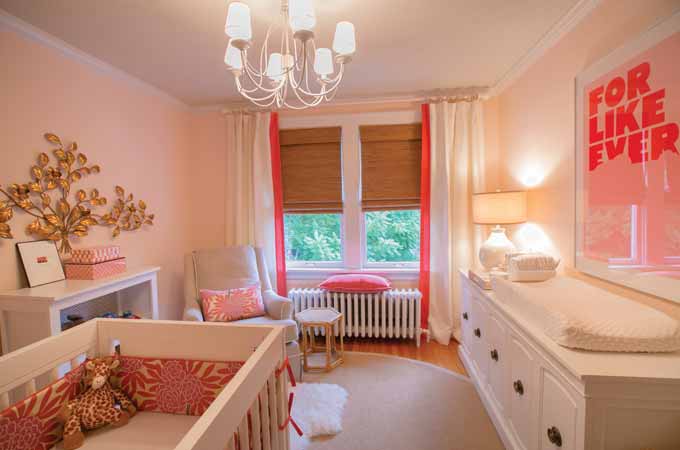
KP | Although I love the dining room and its blue curtains, the room I love the most is my daughter’s nursery. It’s the room I completed most recently, and I decorated it with so much love and excitement for her to get here. It’s a warm room and not too babyish—I walk into it, and it just feels good to be in there.
T&S | It looks like you really know how to maximize space.
KP | In an old University City house, you don’t necessarily have a real foyer, so I wanted to create something that felt like you weren’t walking into the living room.
T&S | You have a lot of art on your walls—where do you find it?
KP | We have a couple of artist friends, and some of the pieces have been given to us by them. The abstract painting near the front door I picked up at a flea market. In the dining room we have two groups of four prints, which are actually old Italian furniture catalog pieces I found on eBay and had framed. It’s hard, and it takes time to collect interesting art, but I’m always looking for something different to fill the walls, because I feel like art is what sets a home apart and makes it unique.
T&S | Is the picture over the fireplace of any special significance?
KP | My husband and I were in Maine a few years ago on vacation, and we came across that painting in a gallery. We loved it but didn’t know if it would fit over our mantel or whether we wanted to purchase it on the spot. I thought it would be fun to buy it for my husband as a gift, but I waited a few years to contact the artist, Peter Roux. He still had the piece, so I had it delivered one Christmas Eve.
T&S | Your son’s room is adorable. How did you put that together?
KP | My aunt actually painted the zebra. I have papier-mâché animal heads on the wall; when I first started seeing those, I thought it would be so cool to do a jungle theme. So I went out to find fun fabrics to make his room cute but not too ‘baby.’ I feel like at some point the pale blue won’t be right for him anymore, but he should be able to grow up with the artwork.
Photos by Suzy Gorman
