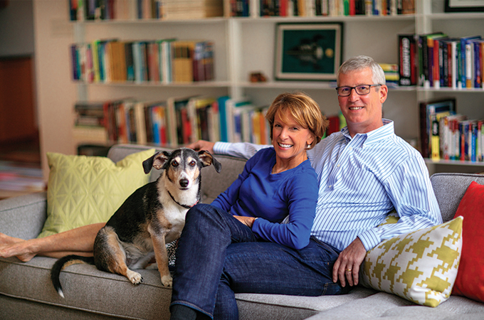
With its clean lines and modern feel, Beth and Bob Taylor’s home is atypical for the Ladue area. The couple, who moved into the contemporary space a little more than two years ago, have embraced its design with midcentury furnishings and bold artwork.
T&S | What attracted you to this home?
Beth Taylor | Before moving to St. Louis, we lived in a Colonial-style home in upstate New York. We decided we wanted something different here, so we got in touch with Ted Wight. We knew he specialized in midcentury modern and could help us find what we were looking for. Other modern homes we looked at were more isolated, unlike this home, which was built in 2005 in a traditional neighborhood. It was important to us to have neighbors, since I don’t work. We’ve thoroughly enjoyed getting to know people. Not being St. Louisans and not having family here, it was so nice to feel welcomed.
T&S | You’ve got a lot of interesting artwork. Do you collect it?
BT | We do, and we’ve tried to incorporate Midwestern or local artists. We’ve picked up pieces from the St. Louis Art Fair in Clayton and Art on the Square in Belleville. Part of the appeal of collecting art is getting out and about to see things, and we go wherever it sounds fun. The previous owners also were art collectors—that’s why they made the walls so large and white. It’s quite minimalist. We decided to keep the walls white and add color through the furniture and art.
T&S | Do you have a favorite piece?
BT | Although it’s not local, one of my favorites is of a scene from San Francisco that’s hanging in the living room above the fireplace. We found it in Carmel, California. Next to that are three pieces by local artist Alicia LaChance.
T&S | Tell me about the art hanging above the stairwell, the multicolored tubes.
BT | Those were acquired by the previous owners, who were so kind to leave them for us. They’re by Myra Burg, a southern California fiber artist, who came to St. Louis to personalize the piece. It’s odd to have someone else’s art, but it goes so well in the space.
T&S | I love the modern look of the home. What was it like decorating and furnishing it?
BT | The previous owners had gone very modern, but I wanted the home to feel a little softer with more curvy shapes and texture. As we acquired furniture of our own instead of hand-me-downs, we bought Scandinavian pieces, which work well in the home. We also acquired a fair amount of modern furniture from my parents when they downsized, as well as original midcentury pieces from my grandparents, including a Noguchi coffee table and Nelson coconut chair.
T&S | What’s your favorite room?
BT | The upstairs living room. Every room is light and bright, but this one in particular has a lot of natural light. It’s spacious, and we have a lot of art in that room, as well. I love the barrel ceiling, which is made of Douglas fir—it’s so unique and it’s a big conversation piece for visitors.
Photos: Suzy Gorman
Architect: Philip Durham
