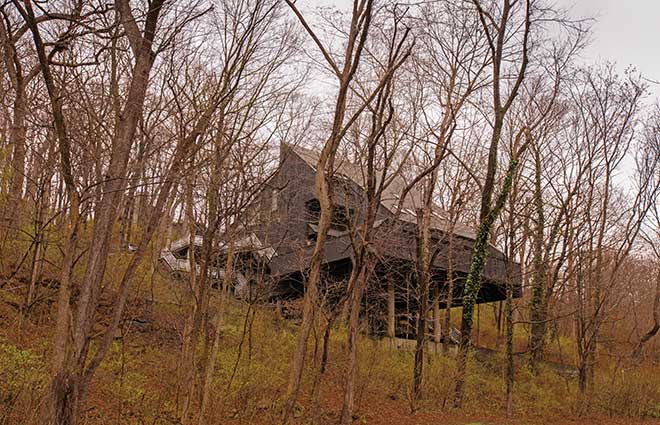
It’s the best of both worlds: a private, woodsy oasis in Kirkwood, within easy access of everything the city has to offer. Over the course of seven years, this home’s owner has carefully renovated the space to reflect her love of design that is clean and minimalist, but also warm and inviting.
T&S | What attracted you to the home?
Homeowner: It’s a unique house with a beautiful setting—it’s like being in the woods. You feel like you’re outside the city, yet you’re still very much a part of St. Louis. And Kirkwood is amazing. It’s got everything you need: the schools, the commerce and the community are all great.
T&S | What’s your design aesthetic?
H | I’m definitely a minimalist: I like clean lines and dislike clutter. Having too much ‘stuff’ clutters your life, because the more you have, the more you have to deal with. I’d rather just have fun with my friends and family. That’s what life is all about. People tend to think of minimalism as this cold aesthetic, but it doesn’t have to be that way. It can be inviting and friendly.
T&S | Tell me about the renovations you’ve done.
H | We gutted the inside of the house; the only room we haven’t touched much yet is the kitchen. We redid all the bathrooms and flooring and took out walls. We did one project at a time, and the process took about three years. Before we started, we lived here awhile so we could decide what we wanted to do and how we wanted to live in the house. Sometimes if you redo everything immediately, you end up looking back and wishing you’d done some things differently.
T&S | Where do you turn for design inspiration?
H | A lot of people go through phases in terms of what look they like, but I’m lucky that my taste and style have not changed over the years. I’ve always loved design and architecture, and I’m always looking at books and magazines and online. I enjoy learning and reading about it. If I come across something I like, I’ll file it away for later. When we redo our kitchen, I have this file full of ideas I’ll pull out that will help me decide exactly what I want.
T&S | What’s your favorite feature?
H | I love the living and dining room area. The views are stunning— it’s like you’re in a treehouse. I also love the furniture in this area of the house. I’ve made so many good memories and had so many great parties here. It just makes me feel good.
T&S | I’m sure you enjoy the deck, as well.
H | Yes, especially in the summer. Weather permitting, we’re out there all the time. Every single room of the house, except the bathrooms, has a deck off of it. For the living and dining room, it’s a huge deck that wraps around the front of the house, and that’s my favorite part. We love being able to sit in the fresh air in a totally private, wooded space.
T&S | The zebra print carpet is a bold choice—what made you decide to take the leap?
H | I thought it was cool and that this house could pull it off. I didn’t really think twice about it. I believe that if you like something, it doesn’t matter what other people think. It’s your house, you should do it—there are no rules!
Photos: Suzy Gorman
