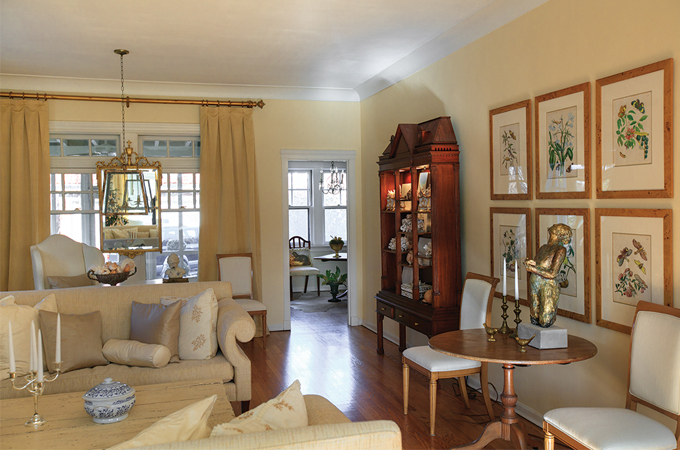
Decorated in whites, creams and golds with accents of glowing wood, Ardell Burchard’s Clayton residence offers a serene space in which to unwind. Its rooms contain meaningful mementos and art that speaks to her soul. The result: a space Burchard loves to call home.
T&S | What first attracted you to this home?
Ardell Burchard | I loved its central hallway plan. Its layout was similar to my previous home in Claverach Park, but this home is larger.
T&S | Have you done much work on it?
AB | I installed central air and heat, refinished all the floors and rehabbed two of the bathrooms. The outside also needed a face-lift, so we tuckpointed and acid-washed the exterior and repaired the home’s 64 windows. We also did a lot of painting, including lightening up the dark wood trim. It was a major overhaul. When we started painting the living room ceiling, the old paint peeled off like dried mud!
T&S | What’s your favorite feature?
AB | The home’s walkouts on the first, second and third floors. I especially love the one on the third floor. It’s a unique feature, and I love the view. I’ve even been able to see Forest Park fireworks from there. I also love how much natural light the home has. Its front faces the southern sun, with the kitchen facing the north. I installed floor-to-ceiling French doors in the back, which really opens it up to the outdoors and lets in the light.
T&S | How would you describe your decorating style?
AB | White and monochromatic, with pops of color. Even when I blend colors, I like them to be in the same tone value. The creams I tend to use have hints of yellow—I’ve been drawn to that color ever since I was a little girl.
T&S | What do you like about the monochromatic look?
AB | It’s peaceful and calming. There’s nothing more serene than when the sun is shining through the front of the house and natural light enhances it all. There’s a strong spiritual side to me, and this home feels spiritual.
T&S | Do you have any tips for readers who might want to pull off the same look?
AB | Be careful not to use white that’s too white. You want things to pop, and not feel stark. Creams tend to have more warmth, which is inviting.
T&S | Where do you turn for design inspiration?
AB | I love to look on Houzz and the blogs of talented designers. My favorite magazine for inspiration is Veranda. I’ve found that I’m very drawn to Texas designers, as well as some of the well-known designers in New York.
T&S | The painting of the bird is unique. Tell me about it.
AB | That is by collage artist Michael Madzo, and I purchased it at the Clayton Art Fair after chatting with him about his work. It’s titled ‘Longing to See Out,’ and I love how whimsical it is. I love birds, so that aspect of the work captured me immediately. It includes hand-stitching, so there’s a textural element to it, too.
T&S | You have your built-ins styled beautifully. Are the items meaningful?
AB | The clock was a gift from my German cousins when they visited, and the china was a secondhand purchase—I got it for $100 at Miriam Switching Post. The little gold and white espresso set belonged to my mother, so it’s very special to me. And then the terracotta pots are handmade and sort of the opposite of the refined china. It’s a fun mix that works.
T&S | Why do you think styling your home is important?
AB | I’m actually in the formation stage of starting my own staging business. I think our home is special, and I really enjoy staying at home and cooking a lovely meal—you can get a bottle of wine for $10 versus paying a lot more out. I also love entertaining in my home and pampering friends and family when they come over. I think people are realizing if they invest in their homes, it gives back to them on a daily basis.
Photos: Suzy Gorman
