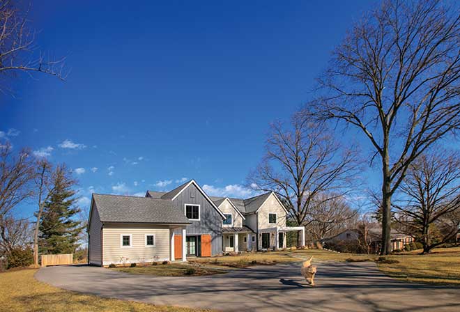
If you didn’t know this house stood in Frontenac, you could easily mistake it for a coastal home—which is exactly what the homeowner wanted to achieve. A student of art and architecture and an interior designer with her own company, Blue Rider Design, she wanted an atypical aesthetic that included lots of natural light, airy spaces and European design elements.
Q | What made you decide to build?
A | We had lived in our previous house for about 10 years and were looking at houses to tear down and rebuild. When we noticed the people just two houses down from us were moving, we made them an offer and bought the property! We knew it was a good investment and rented it out for about a year while we made our plans. The building process was ideal because I could just run down whenever and talk to the contractor. Steve Terbrock of Terbrock Luxury Homebuilders was wonderful.
Q | I thought ‘farmhouse’ when I saw the exterior. Is that what you wanted?
A | When it came to discussing front elevation, I had a difficult time figuring that out. I wanted it to fit in with the neighborhood, but many of the homes have brick and stone exteriors, and we didn’t want that. We back up to a creek and are right across from horses and beautiful land, so I decided to keep with the vernacular history of the area. This whole property used to be a very rural setting, so I decided to go more traditional farmhouse. I didn’t want it to look brand-new, but more like different outbuildings that were built onto one another.
Q | What were your influences beyond the area’s history?
A | I went to school in New Hampshire and lived in California afterward, so I wanted to combine East and West Coast aesthetics. A few years ago, this was a really new concept, but it’s more common here now.
Q | How involved were you from step one?
A | I used to sketch floor plans when I was little for fun! I’m not a trained architect, but I did design and draw the floor plan to the best of my ability and then brought it to our architect, Dave Schaub of Schaub+Srote Architects. He liked my ideas, did his professional tweaks, and then we worked on the exterior together. From then on, I was pricing finishes and fixtures and making sure the flow of the home was how I wanted it. I made it my project. We didn’t hire an interior designer, and it’s nerve-wracking when you don’t have someone to bounce ideas off of. But after a couple decisions, I just decided to trust my gut and intuition. The contractors would always ask to make sure I really didn’t want things like crown molding or trim around the windows.
Q | What was the overall feel you wanted?
A | I knew I wanted to combine a modern Malibu or Venice Beach vibe with the traditional farmhouses of New Hampshire. I wanted it to be very soothing and clean, not cluttered and chaotic. I chose a lot of grays and blues to achieve this, and mimicked those colors on the outside as well. And I wanted tons of natural light! That was a goal of mine because it matches my personality. I love to be outdoors, and I convinced my husband that the more windows we have, the less electricity we have to use! We often don’t need to turn on any lights at all.
Q | What is the fireplace made of?
A | Pine, which is another thing the contractors didn’t agree with! But we were at the end of our budget, and pine is super affordable, so I decided to have a painter whitewash it for a Scandinavian feel. There was a lot of trial and error, but it turned out.
Q | All the different materials in the kitchen work together nicely.
A | I looked to Europe and Australia for inspiration; I had found things I loved years ago online that I tagged. I wanted the kitchen to be clean, modern and timeless. I’m not sure if I achieved that—ask me in 10 years! I fell in love with the tile, which is from Mexico, and kept wondering if it was too crazy. But I told myself that if something is authentic, handmade and artistic, it will stand the test of time. I brought Kim Matthews of KM Designs my layout for cabinets, and she did a great job drawing them up. I knew I wanted to differentiate the butler’s pantry from the main kitchen for entertaining purposes, so I used marble on the counter tops instead of the stone I used elsewhere. I didn’t want the maintenance of marble where I would be cooking all the time.
Q | I love the wallpaper and sink in the powder room.
A | I found the sink as a floor model at Immerse and got a really good deal. It’s cloisonné inlay. I went into Frill Home to get help from owner Marci Marsh with selecting and laying out furnishings, and she pulled that wallpaper out for me in black with white lines. I just ordered it in the reverse pattern.
Q | There are a lot of interesting art pieces. Any stories?
A | The piece in the dining room was purchased at an auction at the Contemporary Art Museum, and I got the one in our bedroom at Little Shop Around the Corner on Vandeventer Avenue. All the others are pieces I painted.
Pictured: The see-through pine fireplace is a focal point in the living areas.
Photos: Suzy Gorman
