Dear Homework,
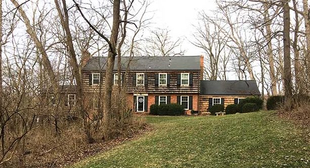
Can you help us refresh our 1963 two-story home in Town & Country? Thank you!
Sincerely,
—Fresh Approach
 Dear Fresh Approach,
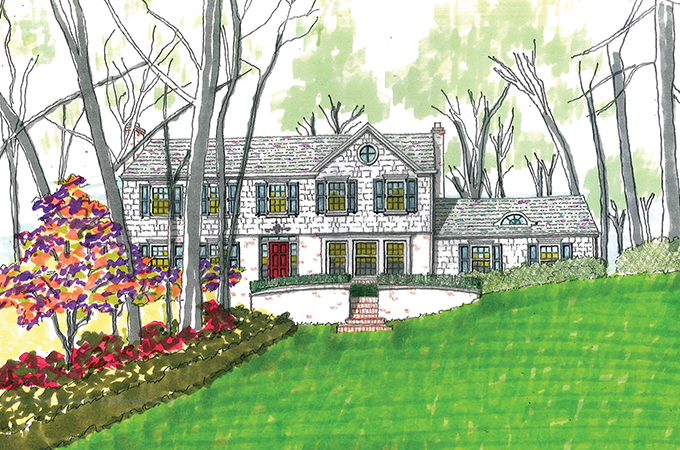
Often, when you think about ‘freshness,’ it’s natural to think light, bright and airy. In this situation, I think lighter colors are definitely in order. You will see that I have painted the shake siding white and whitewashed the brick. In addition, the shutters have been painted a light blue, and the front door is now accented with a bright red. This wakes up the façade from its current slumber.
There also are significant architectural changes. The property’s romantic setting has been acknowledged by added elements that create a new, asymmetrical composition. A new, front facing gable is accented with a round attic window. Wider windows are used in the dining room to align with a new entry terrace supported by a curved, brick retaining wall.
A new slate green roof has been added to better connect the house to the landscape and the new color scheme. An arched dormer gives the garage roof some character.
The beautifully undulating landscape has been tidied up slightly and augmented with some pink dogwoods and red azaleas.
It looks fresher to me … hope it does to you as well.
Thanks for asking,
—Homework
Homework is penned by Paul Doerner, Founding Partner of the Lawrence Group. If you would like your home critiqued, contact us at homework@townandstyle.com.


