
Building this house was a dream of mine. Normally, I’m working with clients to bring their vision to life. With this one, the vision was mine from the very beginning. Every choice. Every detail. I’m so grateful I got to lean all the way into my own design style.
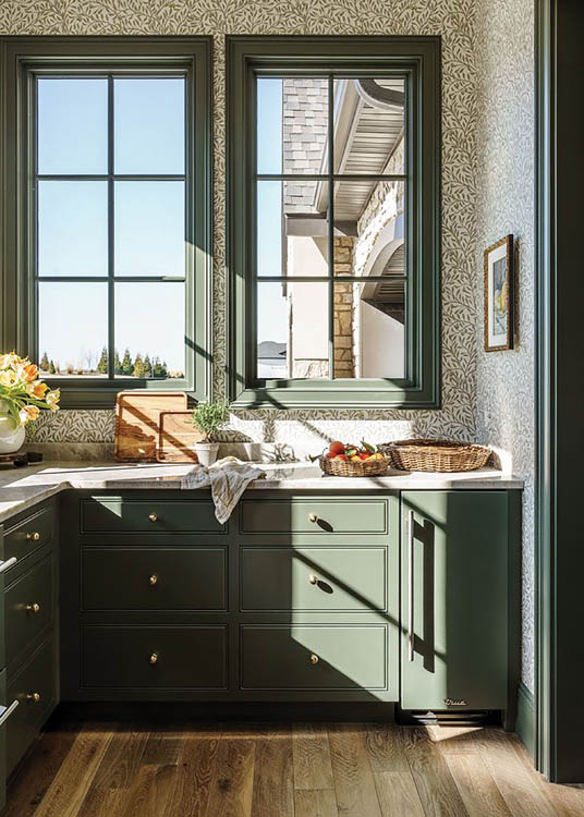
The Scullery – The hardest-working pretty room
Right off the kitchen, the scullery does a ton in a small footprint. Two refrigerator drawers from True Refrigeration. An ice maker. The microwave. Pantry storage on a U-shape so everything is within reach when you turn around. And the Costco door, which I love—you pull up in the garage, open the door and unload your trunk straight into the pantry. It doesn’t have to be huge to be heavy-hitting.
Because this room gets so much light, I went bold and intentional with a pop of color. I matched the cabinetry to True Refrigeration’s olive finish and fittingly enough, brought in an organic olive wallpaper to complete the moment. The print is small-scale and a little nostalgic, just enough to feel interesting without overwhelming the room. Personality, even in functionality. This is the room that proves every square inch can do something for you.
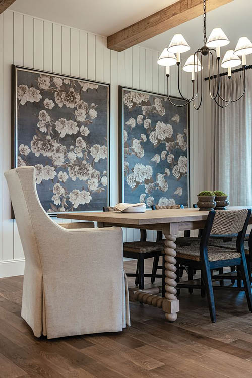
The Dining Room – One dining room, used
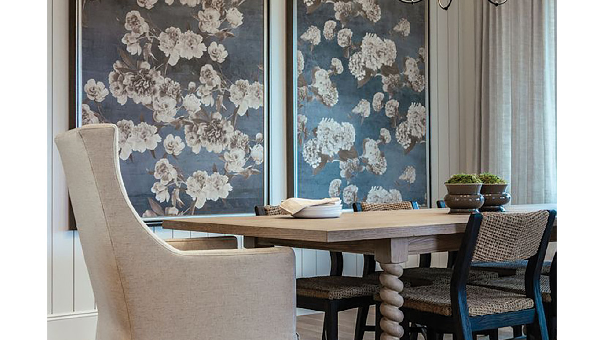
This house has one dining room. Just one. And it’s inside the kitchen. I’m of the belief that you should use every square inch of your house. Formal dining rooms sit unused for 50 weeks of the year and slowly turn into the room where the Amazon boxes pile up—we’ve all seen it. I designed this house for a family that’s actually going to live in it.
So this room had to do both jobs—casual enough for a Tuesday breakfast, polished enough for a real dinner party. We carried the vertical tongue-and-groove and the reclaimed beams from the kitchen straight through. We hung a Visual Comfort chandelier. We chose a substantial nine-foot table—long enough to actually gather people around—and mixed the dining chairs with two end chairs that are slightly different. Everything is high performance, because I wanted it to be really livable. But if hosting a nicer dinner, I want people to feel like they’re not just eating in the kitchen.
Here’s the trade-off worth naming, because it shows up everywhere in this house: losing the formal dining room is what gave us the sunroom and the pocket office. We didn’t add square footage. We just refused to spend it on a room that wasn’t going to get used.
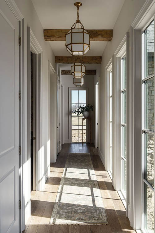
Hallway & Powder Bath – A statement on its own
The hallway draws you deeper into the house. Reclaimed beams overhead. Floor-to-ceiling windows down one side. Visual Comfort lanterns running the whole length, with a beautiful Loloi runner underneath. I didn’t want it to be just a hallway. We kicked up the design with the fixtures and the runner, and now it’s a statement on its own. Then you open the powder bath door, and it hits you.
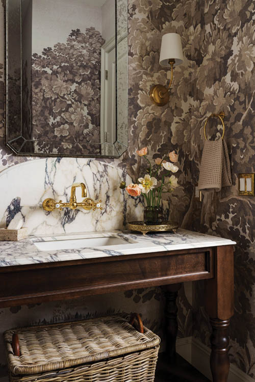
In a powder bath, you might as well pack a punch. It’s a small space to make a statement, and it’s the room every guest uses, alone, with their full attention. So why not go for it? I wanted something unexpected. We did a Schumacher mural, romantic, a little botanical, soft and neutral but visually loud on the wall. Because the mural was so neutral, I knew we could go crazy with the stone. So we paired it with viola marble—exotic, dramatic, equally as eye-catching. Those two are the stars of the room. The plumbing is unlacquered House of Rohl brass that’s going to patina, darken and age into the room over the years. That brass is doing exactly the work I want it to do. It’s making a new build feel old.
Design: Jesse Bodine
Architectural Photos: Matthew Anderson
Lifestyle Photos: Sammie Ploch
Product Photos: Anna Hennessey
Floral Styling: Sarah White
Scout & Nimble is a retail site and blog that aims to make expert design accessible to all. Follow at blog.scoutandnimble.com.