


 ode to a grecian urn …
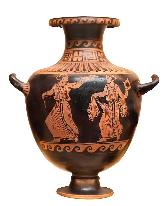
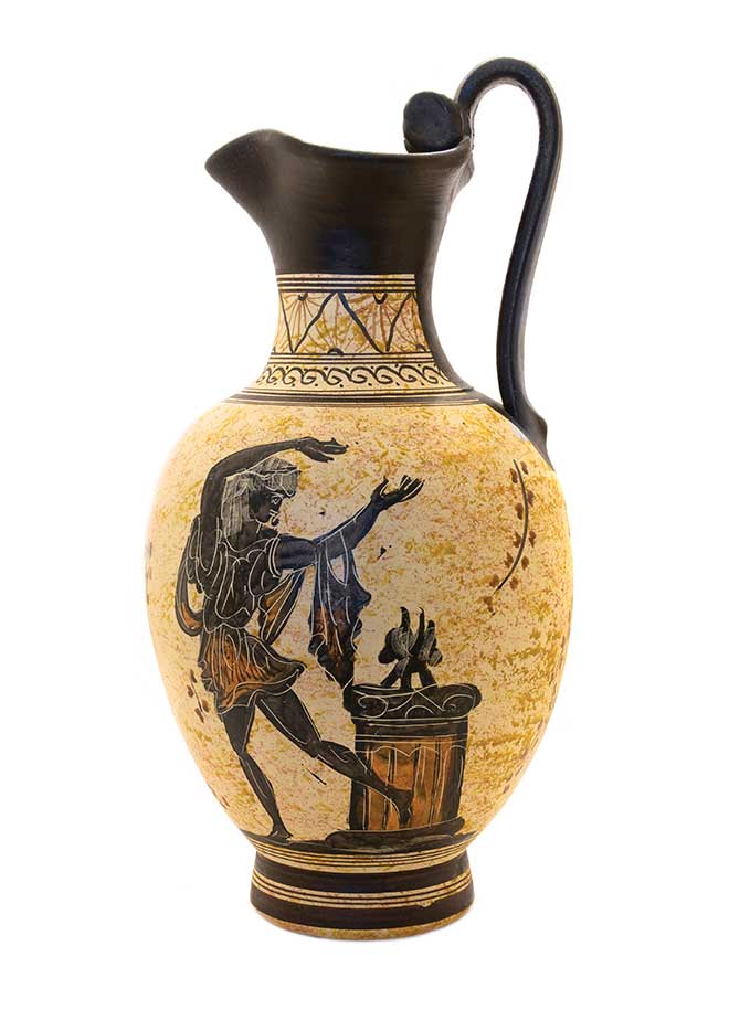
The next time you have the opportunity to place a beautiful bouquet of flowers in a vase, I would like you to think about its history. Once again we owe a timeless design to the ancient Greeks. They were the leading designers of utilitarian objects meant first for use, then for beauty. Remember the Klismos chair? In this case, they took great pride in the decoration of the vase and often, they used this art form as a way to record history. Like today’s decorative arts where choice is everything, they also created simple, plain vessels for use as well.
Culturally the Greeks were always striving for an extremely high level of artistic excellence, so it makes sense that the value of the vases was determined by the complexity and painting that was depicted. As time went on, the detail of the painting became more and more representative of real life and was done in finer perspective.
The Greeks began using a pottery wheel as early as 1800 B.C., so their ability to expand the shapes and sizes of vases was to be expected. The uses for their vases were many, ranging from prizes given to champion athletes to miniature vases for child’s play and vases for storage of food and beverage.
By the 8th century B.C., different shapes had their established uses, whether for funeral rituals, carrying liquid, or storage of grains and food. Today we still use the aryballos and lekythos for olive oil, the pyxis for toiletries, and the volute krater, kylix krater and bell krater for decorative display vases. Thank goodness for the civilized, forward-thinking Greeks!
 come to terms with … tortoise: real or faux
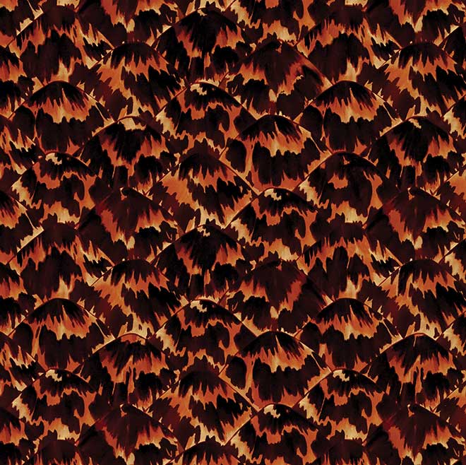
Imitation is the best form of flattery. Since the early 1970s, when the Endangered Species Act was passed preventing the near-extinction of turtles, we now only ‘flatter’ these seagoing beauties of nature. However, a little history lesson on the part the turtle has played in the decorative arts is worth noting.
The term ‘tortoise shell’ is a general reference to the dorsal shell of the Hawksbill sea turtle. The use of this material for jewelry, dishes, combs and decorative items dates back to the pre-dynastic days in Egypt (3500-3100 B.C.). The Greeks, and later the Romans, collected these materials as outward signs of wealth. The Spanish made commercial use of items made from tortoise shell in the 15th century, broadening the appeal. Obviously, with a wider audience came multiple uses for this material. Furniture inlays, boxes, eyeglass frames and jewelry were adorned with or made from this exotic animal shell.
Fast-forward to the Victorian era when the resurgence of decorative items once again lent a well-traveled look to homes and the well-dressed figures of the day. It was rare to enter a properly designed Victorian home and not find one or multiple examples of this type of craftsmanship.
Now, as a result of the aforementioned act that passed in the ’70s, only antique tortoise shell can be sold legally—no new items. The new law opened the door for artists to create a faux tortoise look on everything from woodwork to small snuff boxes. The faux because just as sought after as the real tortoise in the quest for a well-decorated home. The possibilities were limitless: Artists could decorate walls, ceilings and floors. Today, fabrics, wallcoverings and objets d’ art can be found with tortoise patterns. The good news is not a single tortoise was harmed to create these well-designed interiors!
design redux
50 shades of … Pleasing Pumpkin Fall is my favorite time of year, and it has been another great one in St. Louis so far. This year we are experiencing a marvelous burst of color, and it is so easy, dare I say exciting, to find inspiration in the color palette of nature.
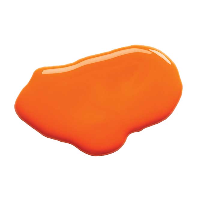
When I began designing 32 years ago, there is one color from nature that I resisted, no, refused, to use: orange. For some reason, I had an immediate gut response to the color that sickened me. Well, I must have gotten over my allergy, since now I gladly embrace it. Actually, pumpkin is now one of my favorite shades. It’s a softer incarnation of its parent color, orange, and not as rosy as its sister, coral. There is a depth to pumpkin that works with a broad range of other colors to create various fun and interesting combinations that can evoke traditional warmth or contemporary freshness. For example: pumpkin, brown and cinnamon; pumpkin, navy and white; pumpkin, green and yellow … you get the picture.
When you drive down the street and see the wonderful colors of changing leaves and notice how they all complement each other, it’s easy to understand how there are limitless possibilities when working with the colors of nature. And don’t forget: take a chance with pumpkin.
