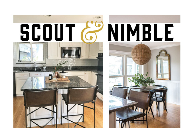
Here’s a peek into how we created a beautiful new eat-in kitchen space in just a few simple steps. The kitchen already had great bones; it just needed a little updating. This area was a great example of a room that got a completely new look from a few high-impact changes.
The first item on our to-do list was to remove the wallpaper and carry our main wall color, London Fog, throughout the kitchen. We added beautiful white ceramic subway tile in a brick set pattern as the backsplash and carried it around the kitchen window. We also decided to switch out the traditional hardware for a more modern polished copper. This is such a simple change, but it makes a huge impact on the overall look of the room, adding instant warmth with a cool edge.
We kept the lines simple and clean with our furnishings. First, we chose a sleek midcentury-style dining chair with a black finish. The simple Parsons table is perfectly suited to this kitchen. It’s subtle and understated, but the beautiful reclaimed wood mixed with the black finish on the chairs adds so much character. The leather and steel counter stools are both beautiful and practical. The leather makes it easy to wipe up spills and messes, yet adds so much warmth to the space!
The basket chandelier adds a relaxed feel to this space and brings in some gorgeous texture. We pulled in one of our favorite pieces, a copper mirror, and placed it on the half wall behind the table to bounce light around the room and make the space feel larger. The mirror echoes the copper hardware in the main part of the kitchen and adds an old-world charm to this room. The patina on the mirror frame is just gorgeous.
Scout & Nimble is a retail site and blog that aims to make expert design accessible to all. Follow at blog.scoutandnimble.com.


