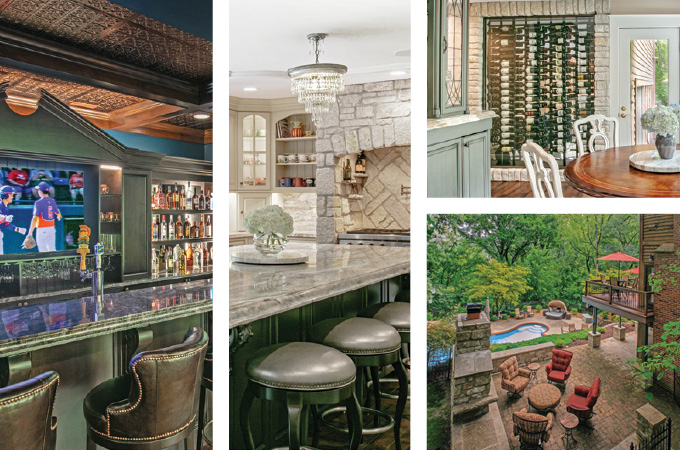
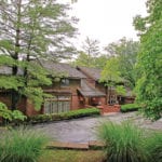
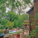
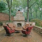
Whether it’s on a bustling city street or a quiet country lane, a home’s surroundings can have a big impact on the design inside. That’s certainly the case with this home, located on a beautiful, wooded lot off Carman Road. the homeowners wanted the interior to complement and spotlight its lush surroundings. Designer Karen Pepper Jacoby of Edwin Pepper & Associates gives us an in-depth look at how she brought the outside in.
T&S | How did the exterior impact the design of the interior?
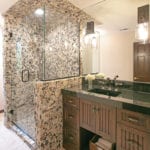
Karen Pepper Jacoby | It’s an older home, and we wanted to bring it back to life. The design really plays off the topography and how it’s situated in a wooded area. We changed the footprint of the first floor and opened it up so it’s all about the views to the outside. Everything was designed so you can look out, and it almost feels like you’re outdoors. The materials we used also were meant to look very natural. For example, in the bathroom, we used pebbles in the shower.
How would you describe the homeowners’ style?
They really wanted the house to focus on family and comfort. When we started the process, I’m not sure they really had a vision for the interior. Once we sat down and I asked some questions, we started putting ideas on paper and went from there. We put it together like a puzzle—a little bit from the wife, a little bit from the husband, a little bit from the kids.
What renovations were done?
We did a total renovation on the first floor and lower level. We wanted to create a good flow between the upstairs and downstairs. We also made sure every room is usable and has a purpose.
Tell me about the kitchen and breakfast room.
It was designed for use and convenience, and we wanted everything to be light and natural. We used neutral colors and stone, and the custom cabinets and island were designed for the family to use every day and for entertaining. The stone slabs used for the counters nicely complement the limestone around the oven, which carries over into the pantry and breakfast and wine rooms. It creates continuity between different spaces. The breakfast room features a great custom-designed piece that can be used for both serving and storage. There’s also a little bit of bling with the custom crystal lighting fixtures.
What was the inspiration behind the bar?
It is part of the lower level, which we wanted to make feel like part of the main level. I would say the style is like a club with a twist. It’s a very comfortable and usable space with a versatile feel. We wanted to respectfully include older design elements and mix them with a new look. The ceiling is tin, and there are great antique, candle-lit coach lights that add a hint of nostalgia and create ambience. It’s timeless and authentic to the client.
The glass-walled wine room is unique.
There was a big, blank wall between the kitchen and living room that was an obstacle to opening up the space. The homeowners have a great wine collection, and we wanted to come up with a way to display it. We met with a company that specializes in such rooms and made sure the design was appropriate for storing wine. The stone pulls from the kitchen, so it creates a connection between that space and the living room. It feels like it always has been part of the house. It’s designed for the homeowners’ taste and the way they live.
How did you add your own touches to the space?
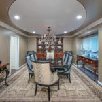
I believe textiles really create the feel of a room and give it warmth, so all of the fabrics were carefully selected. In the dining room, there’s an oval on the ceiling, my signature accent. It makes the ceiling feel higher and creates the illusion of a dome. The traditional dining room was the perfect location for it.
Do you have a favorite room?
My favorite space is their favorite space: the see-through wine room. I also love the kitchen. It’s very open, and the views are breathtaking. It embraces their vision and enhances their lifestyle. Through it all, it was most important to me that I create spaces they love.


