


Different colors have definite effects on mood, from cool, soothing marine shades to bright, sunny tones that lift the spirit. It makes sense to think carefully about their impact when decorating your home, says April Jensen, founder and CEO of ADJ Designs. Illuminating walls with color can send a message that’s bright and optimistic, but so can smaller bursts of various hues through fixtures, accents and accessories.
Whether you are painting a room or adding color against a neutral background, it pays to think less conservatively from time to time, Jensen says. “Especially in the past year, homeowners are feeling a bit more adventurous with bold color,” she says. “I advise them to do what feels right, especially when recapturing nostalgia or paying tribute to something that is important to the family. I tell people to treat bright color like a piece of art: It doesn’t have to match everything perfectly, and if it brings up positive memories or feelings, you should use it.”
Jensen says many people prefer to start with white, gray or beige walls, but these backgrounds can be a great jumping-off point. “Think of walls like the basic jeans and white T-shirt you wear,” she says. “You can layer them with any color you like for a striking effect. In a room, colorful accessories can take the form of bright cabinets, bookcases, or a cheerful desk or upholstered seating area.” Jensen says a local company, The Resplendent Crow, sells refinished vintage furniture in bright hues to liven up a room.
She says color is returning to interiors with wallpaper as well. “Suppliers like Rifle Paper Co. and Katie Kime sell colorful papers you can integrate into traditional and modern looks,” she notes. “They feature rich, beautiful colors like cobalt and Delft blues, persimmon, jade green and fuchsia. Any of these can be echoed in sofa and chair upholstery for a breath of fresh air in a room.”
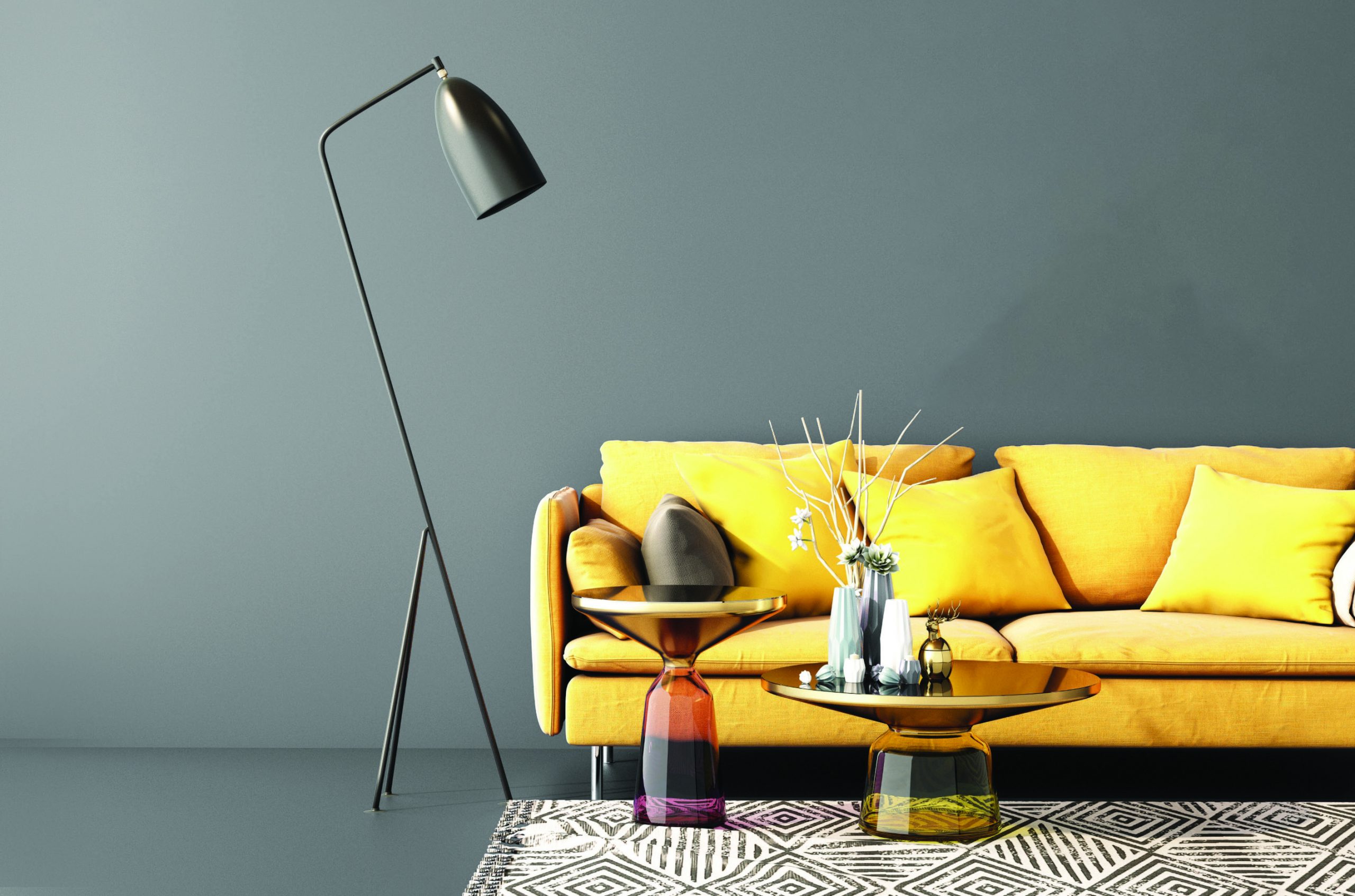
shades of 2021
Color branding company Pantone normally selects one trending hue to represent each calendar year, but for 2021, it settled on two: ‘Illuminating,’ a cheerful yellow, and ‘Ultimate Gray,’ a stony shade. They are meant to convey the idea that contrasting perspectives can work well together. The company said it chose them to send a message of “strength and hopefulness that is both enduring and uplifting” in a difficult year.
how do colors affect us?
- Our emotional response to a color is determined by its saturation, or purity, and its brightness, or how light it seems.
- Warm colors like oranges and yellows actually make us feel that the room temperature is warmer. The reverse is true of cool colors like greens and blues.
- Green is linked to creative thinking, so it works well in offices and studios. Red conjures up strength, violet is associated with sophistication, and blue evokes comfort, so all can be used in a variety of spaces.
Source: Psychology Today

