Decorating a home is a chance to put your stamp on one little corner of the world. Moving into a house that is already built might mean working within some limitations, but it still offers a blank slate to elevate and evolve your personal style. One Clayton homeowner combined modern sensibilities with a traditional property to create a sophisticated space, with a little help from Elizabeth Glazer Designs. Here’s a peek inside at the results.
Q | What attracted you to the house?
A | I didn’t have a list of must-haves when I was looking for a home, but this one seemed right. The size was what I was looking for, and while it’s around 7 years old, it’s still new enough that maintenance is easy. I didn’t have to do any big renovations. I also really like the location. The neighborhood is close to all of the great things there are to do in Clayton.
Q | Did you make any changes?
A | Other than redecorating the interior, the only thing I did was put a koi pond in the backyard.
Q | How would you describe your design style?
A | I’m drawn to modern design. I like clean lines and open spaces. I’d also say I have an inclination toward more neutral colors.
Q | Did you have a vision for the interior?
A | I worked with interior designer Elizabeth Glazer to create a cohesive space that matches my tastes. She brought in the furniture and developed the color palette.
Q | What is your favorite space in the home?
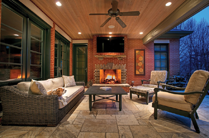
A | The outside patio with fireplace. I use it as both a personal retreat and a space for entertaining. It has a TV, and in the spring, summer and fall, I’m out there all of the time. Elizabeth and I chose furniture that would complement the interior.
We also spoke with Elizabeth Glazer about how she tackled the home’s design.
Q | How would you describe the design?
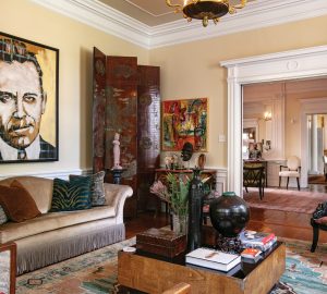
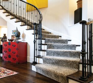
A | It’s a traditional home with modern finishes that give it a clean and uncluttered look, which is what the homeowner wanted.
Q | What is unique about the house?
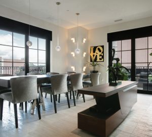
A | The back wall is all glass. It’s almost like a big open pod, and the exterior feels like an extension of the interior. I wanted to make sure the colors and designs inside would transition to the outdoor living area. Design-wise, it all coordinates.
Q | How did you approach each space?
A | I wanted the style to work with the bones of the house and reflect my client’s tastes. I think the house has a really earthy feel with lots of wood and stone. There are stone floors in the living room, and the bar has big chunks of stone. The hearth room and the kitchen are heavy with lots of wood. My goal was something sophisticated with clean lines that would be warm, not cold or stark. I think the wallpaper in the powder room is a good example of the house’s style. It has the appearance of crushed gold and an interesting pebbled texture. It’s elegant but not overly ornate, and it looks really cool with the stone floor. I saw it and knew right away the homeowner would love it.
Q | What is your favorite design aspect?
A | I love the overall openness and flow of the house. It is great for entertaining. The patio is accessible from both the living room and the kitchen. The living room has two walls of windows and is attached to the amazing bar. It’s very airy. I also love the transition from the living room to the hearth room. You flow from bright and open to warm and cozy.
Photos: Suzy Gorman


