Dear Homework,
My husband and I bought our house about two years ago, and it was supposed to be a compromise between charm (me) and modern practicalities (him). The façade has always bothered me. We want to keep the Tudor look, but it seems like it was forced, and the orientation of the front porch looks wrong to me. All the landscaping has to be replaced, so we’d love your thoughts on enhancing curb appeal, too. Thanks for your consideration!
—Transform my Tudor
Dear Transform my Tudor,
I agree with you that the overall composition and balance of your house leaves much room for improvement. I especially focus on the ‘stone sideburns’ that bracket the façade. All handsome houses have a strong sense of composition because the component parts (doors, windows, porches) form a hierarchy in which the most important features (perhaps the entry) dominate over subordinate ones. Beyond this, it is necessary for all these parts to be in balance with each other.
—Homework
[scheme I]
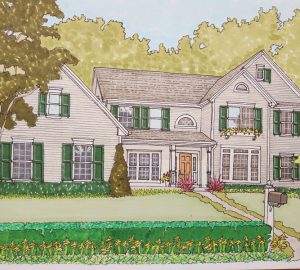
In the first revision, you will see I have added a half-timbered gable to the entry porch. This and a new raised gable on the service wing help spread the half-timbering along the façade, making it seem less like an afterthought. I also have simplified the design of the original half-timbering, eliminating the ‘x’s.’ I also show a triple, arched-top window in the dining room. This and the new entry porch help draw the eye to this portion of the composition. New, lower planting makes the house look taller, and I deliberately hid the stone sideburns. It looks better, but we can do more.
[scheme II]
In this version, I have been much more aggressive with the architecture, enlarging many of the windows, raising the entry element, adding light piers and a hedged drive court. A new street tree helps frame the composition, which now seems much less timid and unconvincing.
[scheme III]
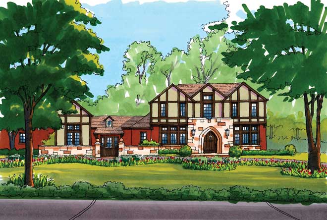
The first two schemes show how the house can become more forcefully asymmetrical. This version shows that the main body of the house could also become symmetrical while still feeling more authentically Tudor. New stone elements distribute the material more evenly across the elevation, making it feel integrated rather than a last-minute addition.
Further, a new large gable and a walled service court increase the visual importance of the one-story wing, making it feel less like a tail and more like the ‘grammar’ of the main house. Finally, this scheme shows a less formal and more English Country landscape scheme. Curving beds of flowers add charm and color, and the plants at the street edge give the feel of a typical English hedgerow. There are many ideas here to choose from, but any combination will help transform your Tudor.
[HomeWork is penned by Paul Doerner, president, The Lawrence Group. if you would like your home critiqued, contact us at homework@townandstyle.com.]


