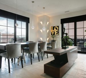
St. Louis is made of many vibrant and eclectic communities that add to the joy of living here. Mary McKown cherishes the uniqueness of her University City neighborhood and home. She let us have a look inside at the kaleidoscope of color, texture and style she’s created—with a little help from T&S design columnist Alan Brainerd!
T&S | What made you decide on University City?
Mary McKown | The neighborhood is just so charming; it’s interesting and different. It was designed in the 1920s with the idea of providing housing opportunities at different price points. There are apartment buildings, bungalows and big estates all mixed together. It was very forward thinking at the time. The neighborhood also has great cut-throughs to Flynn Park. I don’t think there’s another neighborhood in St. Louis quite like this one.
T&S | What attracted you to the home?
MM | I think my husband and I made the decision to buy when we were standing in the foyer. I just got a sense of the house. It was built in the 1920s, but it didn’t feel old and dark. There’s a freshness to it. It sucked me in, and I didn’t look back. But I wouldn’t advise that for most buyers. It probably wouldn’t be considered prudent decision-making!
T&S | Any major remodels?
MM | We’ve redone every surface in the house. The only thing that remained were the walls, but we’ve kept true to the original intent of the home. It had a good vibe, and I wanted to keep the flow and lightness that attracted me. We bought the house in 1995, but it wasn’t until three years ago that we finished converting the third floor into a master retreat. The round quarter windows are original; everything else was brought in new. Last year, we did an addition that includes a family room and casual eating area. We have three teenagers, and the old family room wasn’t working for us. Originally, the home had a sleeping porch, but we turned it into a den and study space that we really enjoy. I feel fortunate to live here. I want to make it as nice as possible, not only for my family but for generations to come. I told my contractor that I wanted whoever has the house in the future to know that someone cared. The person who built this house really did, and I do, too. I want others to be able to enjoy the home, celebrate and make great memories.
T&S | Did you have a vision for the interior?
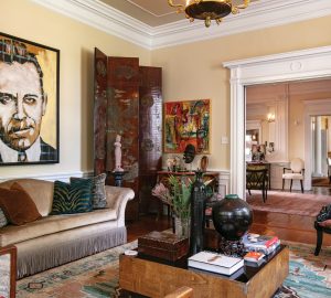
MM | I started working with designer Alan Brainerd about 15 years ago. We’ve executed a collaborative vision. It reflects my taste and my husband’s. We have a fair amount of original art, and my husband is a huge literary fan, so we have framed works and letters from authors like Oscar Wilde, Ezra Pound and Henry Miller. We also have a very strong rule in our house: If it’s not comfortable, it doesn’t come in the front door. We want our kids to respect the house but also enjoy it and entertain their friends here. No space is off limits. Alan certainly has helped us create the best version of our vision.
T&S | The Design isn’t afraid to mix different colors, patterns and textures.
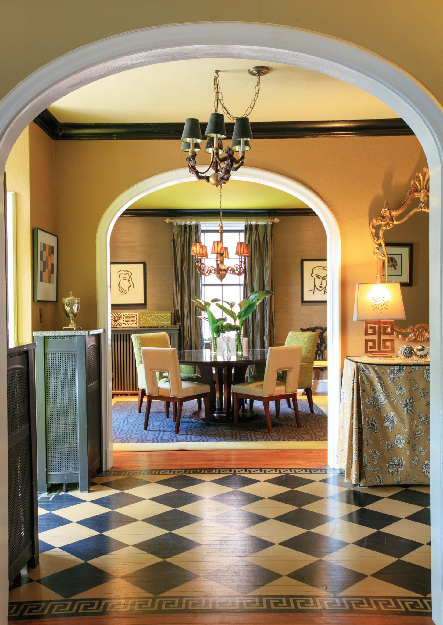
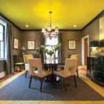
MM | That’s a definite marker of the aesthetic. I don’t think my style has a definition. I’m pretty free about what I like. If I’m drawn to something, then I’ll buy it. I found the painting in the dining room at an auction. I wasn’t looking for a focal point, but it attracted me and became a starting point for the design of that space. It’s kind of like my neighborhood. The structures are different, but they belong together. All the rooms are different, but they complement each other. It’s what makes it interesting.
T&S | You mentioned your original artwork. Any interesting stories or favorite pieces?
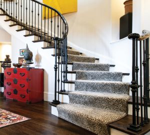
MM | There are two pieces in the new addition that are from an artist in Utah. I discovered her online. I bought a completed piece and commissioned an original. When she posted a picture of the commissioned piece in our house, someone commented that they couldn’t tell if the art was made for the room or vice versa. I think that’s a great compliment. The third floor has two works done by a local artist. My husband picked one piece, and I picked the other. I wanted the art to pull me up the stairs, to draw me into the space. It makes me smile every time.
We also spoke with Alan Brainerd to get more insight into the home’s eclectic design.
T&S | How has the design of the house evolved?
Alan Brainerd | Mary and Mark’s children are older now, so that changes the way they use their house. It’s become more relaxed and transitional in style. Early on, she was a little more traditional in the base concept of what she envisioned. Now, it’s somewhere between traditional and contemporary. A little edgier, much more updated.
T&S | How did Mary’s personal style affect how you approached the house?
AB | I always approach design with the idea that when the project is done, it doesn’t look like I’ve been there. It’s very important to me that the home reflects the owner’s personal style. Mary and I work well together because we both have the philosophy that if you really love something, there’s a place for it in your home. Mary loves whimsy, from the wallpaper in the kitchen to the paint on the inside of her drawers. There’s an element of surprise and attention to detail, which is a joy to work with. Most people hire designers to pay attention to the little details, but when you have a client who loves them equally, it’s a match made in heaven.
T&S | What’s your favorite design element in the house?
AB | I love her whole house! The third-floor renovation is probably my favorite. It transformed the way they use the home. Mary told me her husband sees the master suite as a sanctuary. When a husband finds a space he loves within the design, it’s the highest compliment.
Photos: Suzy Gorman


