jill worobec, mosby building arts
House location & type »
A 1914 Tudor-style home in Clayton
Goals of the homeowner »
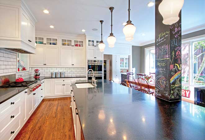
The owners had an oddly divided kitchen with a hard-to-reach butler’s pantry. By removing walls and creating new entry points, we transformed it into a modern kitchen with an era-appropriate look that provides natural light and plenty of work and gathering spaces. The kitchen includes a laundry room, dining area, chalkboard column and a swivel-mount TV above the refrigerator.
Favorite part of the project »
I love the way the kitchen and butler’s pantry now are integrated into a cohesive space that includes the back staircase. The natural light from the dining area windows floods the space, making it happy and alive.
Favorite item »
Initially, we wanted to eliminate the column near the middle of the kitchen, but structurally we were unable to do so. We turned an obstacle into a fun feature by integrating it into the island and covering it with chalkboard paint. Now it’s a colorful gathering point that constantly changes.
photo: Toby Weiss for Mosby Building Arts


