


It’s been a rough ride, but we’ve made it to 2022. It’s safe to say we’re probably all looking forward to leaving the last two years in the rearview mirror, and it’s the perfect time to embrace change. Decor is an easy place to turn over a new leaf this year, and you don’t need to make major changes to give your home a refresh.
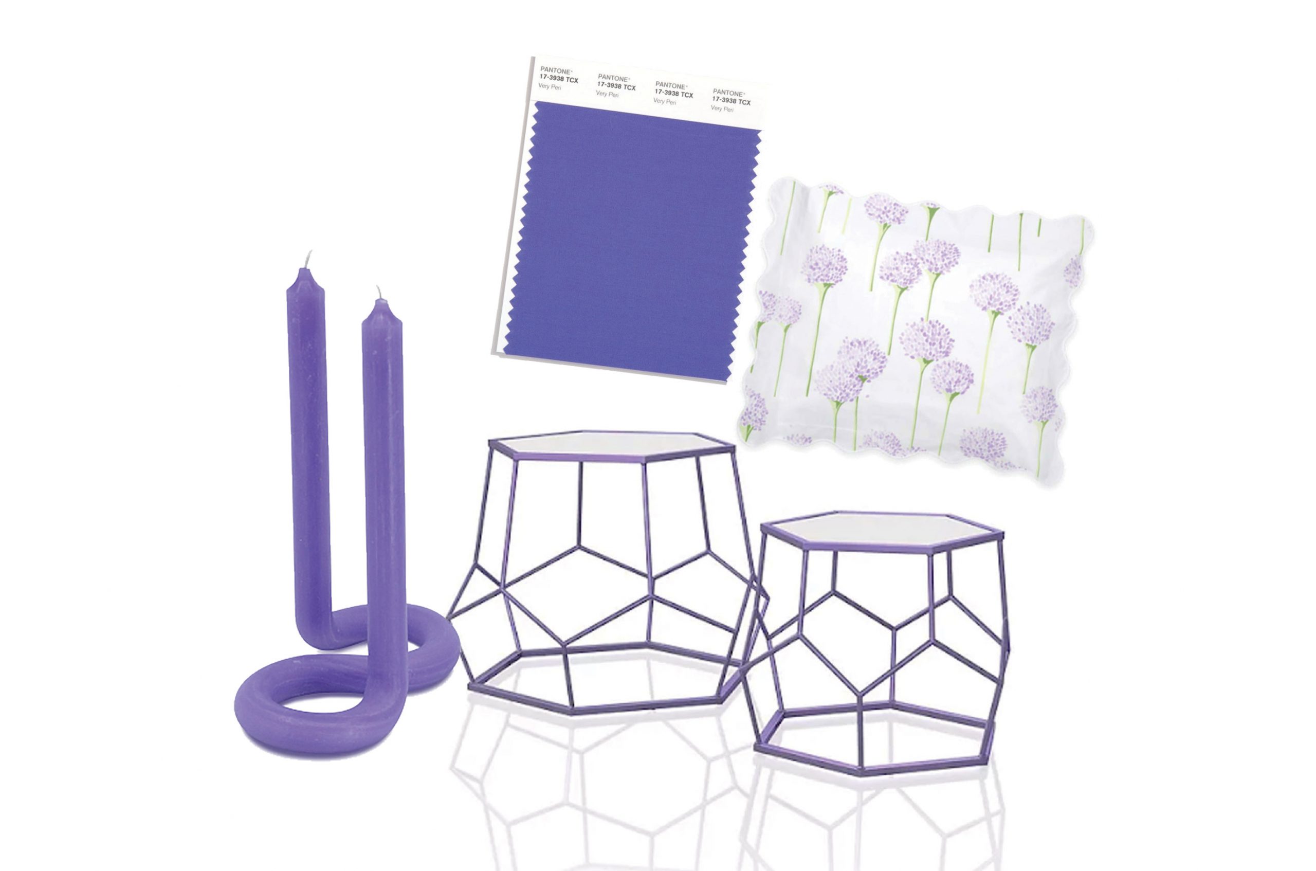
Color is a great source of inspiration. For 23 years, the experts at Pantone have combed art, fashion, technology and more for inspiration to pick a color that best presents the cultural moment. For 2022, instead of selecting a preexisting shade, a new color was created: Very Peri. A little bit blue, a little bit purple, the periwinkle hue was selected as a representation of the transitional time we’re currently living in. Since our digital and physical lives are more connected, the color demonstrates how color trends from both influence and manifest in one another.
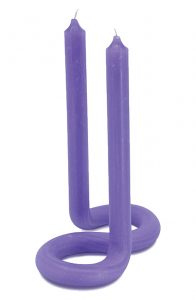
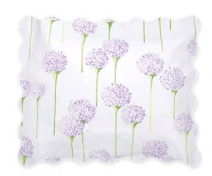
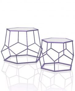
Very Peri is all about inspiring creativity and curiosity, so the bright hue is perfect for bringing some
playfulness to a space. You can experiment with the color by introducing it through accents and wall
colors or incorporate it in with a piece of furniture.
Periwinkle not your thing?
Pantone isn’t the only color experts making predictions for the year. Here are some other hues to consider for a brighter 2022.
- Vibrant teal: Krylon named Satin Rolling Surf as its color of the year. Like Very Peri, this teal hue is all about bringing optimism and brightness to a space. This rejuvenating color is perfect for outdoor areas as well as interiors.
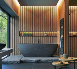
- Warm earth tones: From organic modernism to the revival of ‘70s design, warm browns work with a lot of trending design styles. You can brighten these shades up with light neutrals or bring some moody sophistication by pairing them with jewel tones.
- Faded indigo: Like periwinkle, this color is a modern twist on blue. Reminiscent of a washed-out pair of jeans, this hue
offers a comforting, relaxing feel with warm undertones that pair perfectly with soft neutrals. - All shades of green: With how often this color popped up on experts’ lists, the other hues should be green with envy. Whether it’s something bright and a little funky like an avocado shade or something more muted and subdued like a silvery gray-green, you can’t go wrong with introducing a little green into your decor.
Sources: Pantone, Better Homes & Gardens

